BACKCASE·HAH · 07/10
PORCH MOVING GROUP·2024 TO 2025·MOVING SIMPLIFIED
HireAHelper: Conversion ReDesign
Client
HireAHelper
Engagement
2024 to 2025
Role
UX Design, Creative Direction
Deliverables
Optimized Experience, CMS Dev, Design System
01 — Snapshot
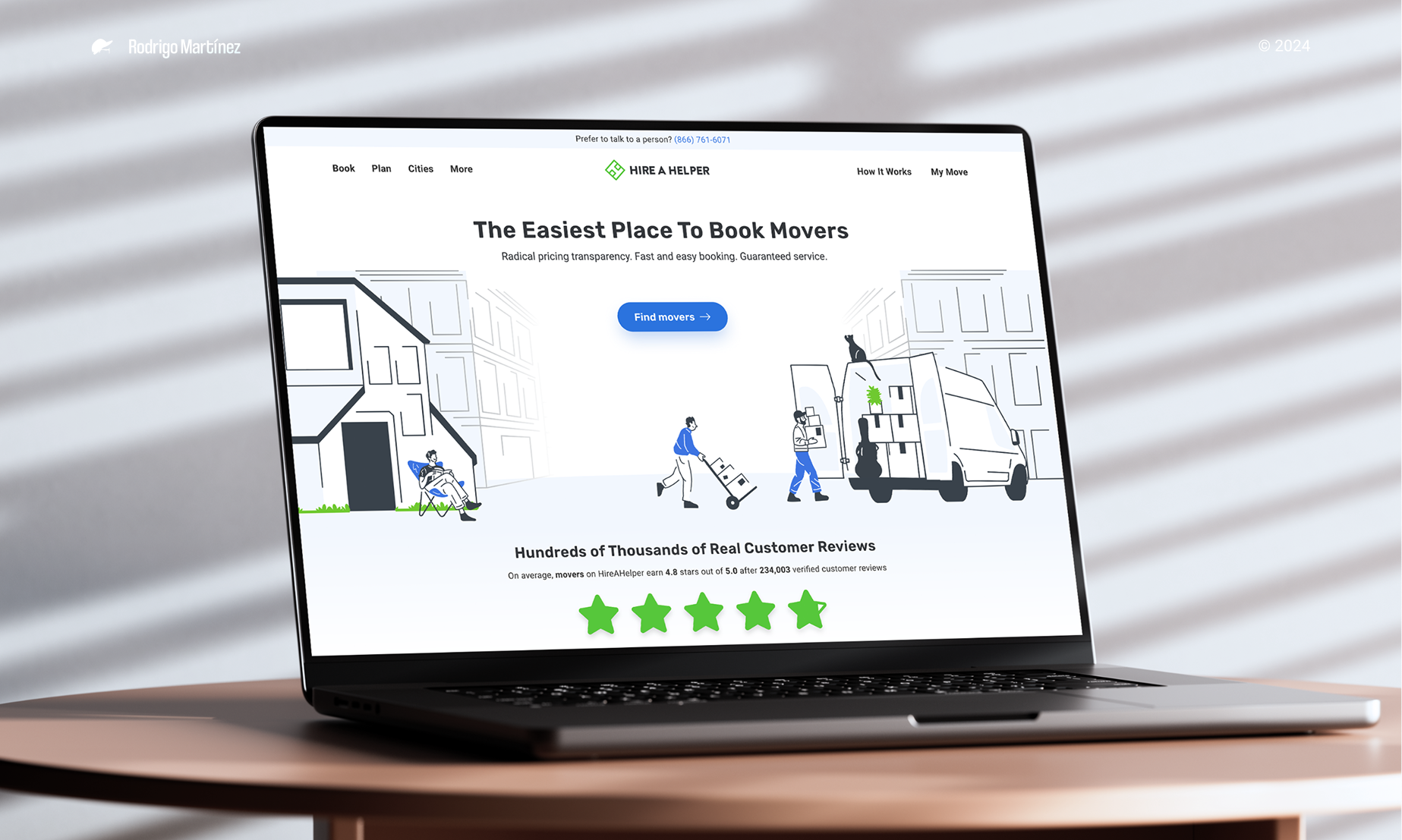
HireAHelper had outgrown its own site. The platform was working, but as traffic grew so did the friction: confusing filters, a long checkout, a visual style stuck in 2017. My job was to rebuild the booking experience into something people actually wanted to use.
Over three MVPs, we untangled the funnel, modernized the look, and shipped a design system that let the team move faster without breaking the brand. The numbers followed: higher conversion, more revenue per visitor, and a smoother ride from search to checkout.
02 — Goals & Challenges
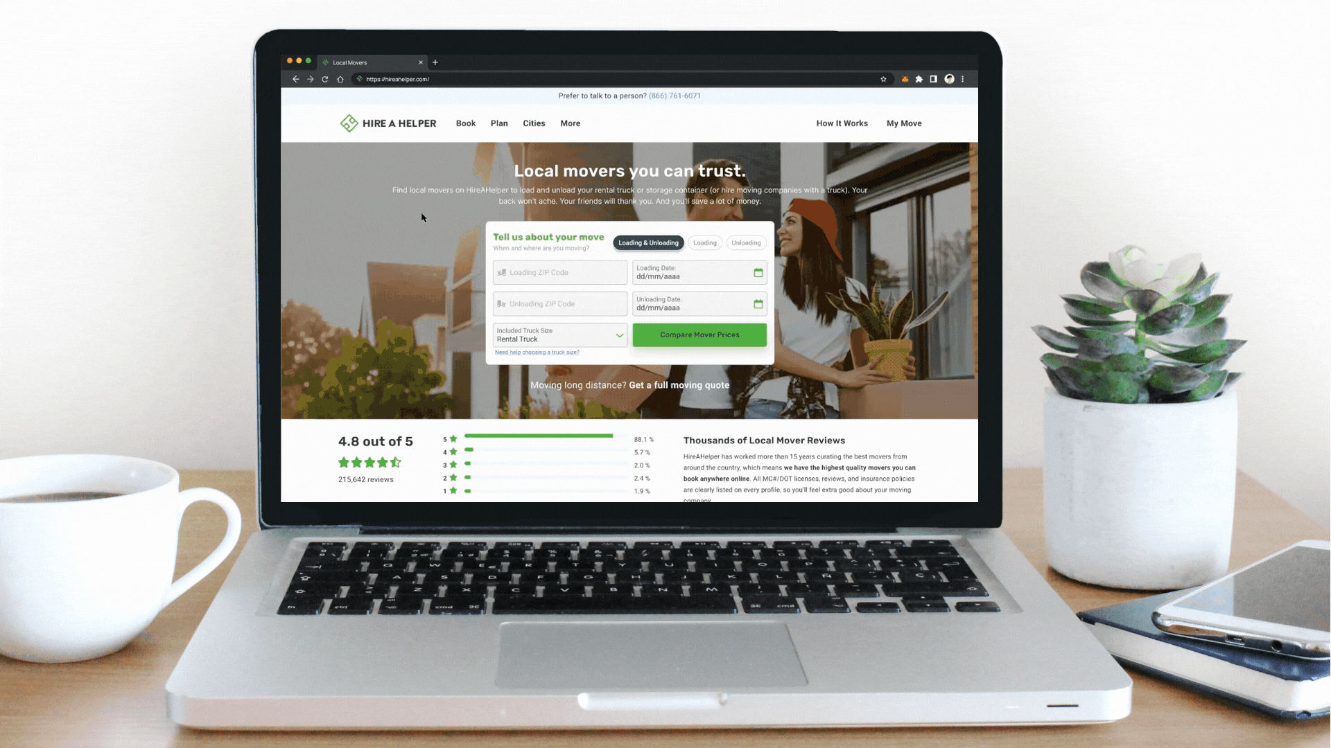
HireAHelper has been connecting people with movers across the US since 2015, one of the originals in online mover booking. After seven years of growth, the site that got them here wasn't the site that would take them further.
Users were frustrated. Filters confused them, the checkout dragged, and the brand looked stuck a few years behind. The value prop wasn't landing either. We needed to make the whole thing feel modern, fast, and trustworthy, without losing the users we already had.
Before redesigning anything, we needed to see exactly where the experience was breaking down. So we talked to people (stakeholders, customer service reps, movers, real customers) and watched how they actually used the site.
Pair that with a heuristic audit, and the patterns showed up fast.
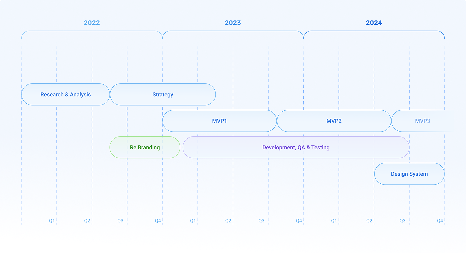
Research & analysis
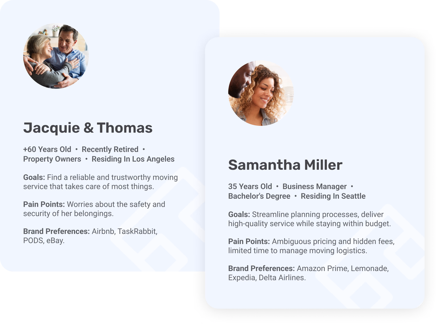
From the interviews, a clear persona emerged, and with it a real picture of where people got stuck, where they bounced, and where the experience could actually win them over.
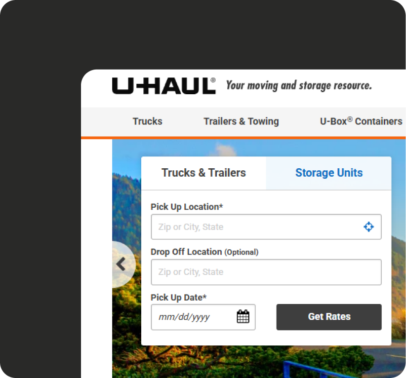
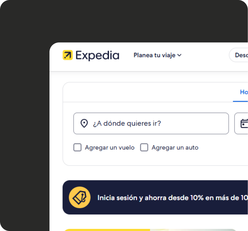
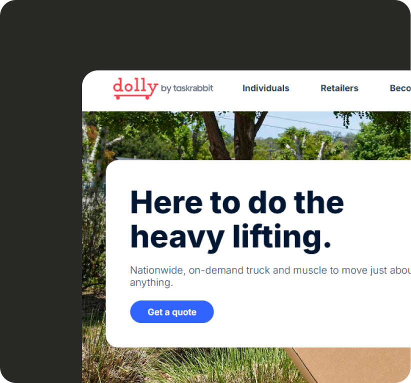
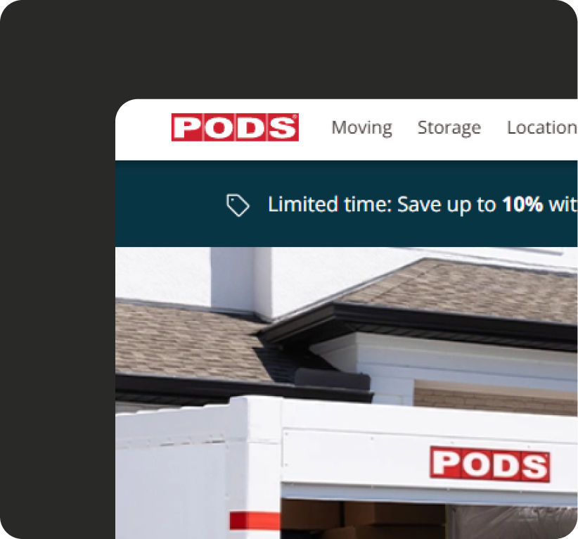
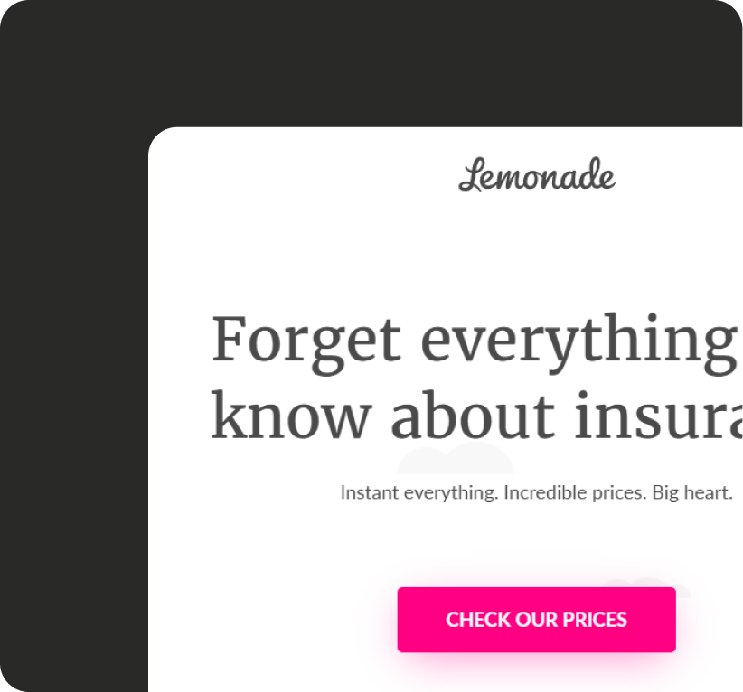
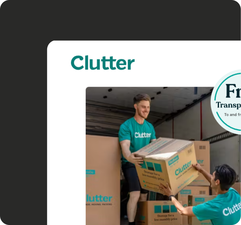
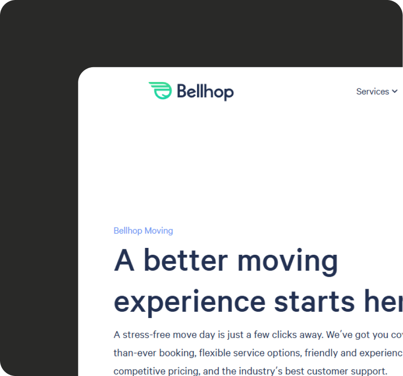
With our own customers mapped, we looked outward, studying how the rest of the industry handled booking.
Early on, the plan was to model HAH after an e-commerce marketplace: browse, compare, book, like a vacation rental. But the deeper we went into both our competitors and our own service model, the clearer it became: our value prop didn't quite fit that shape.
1st mvp
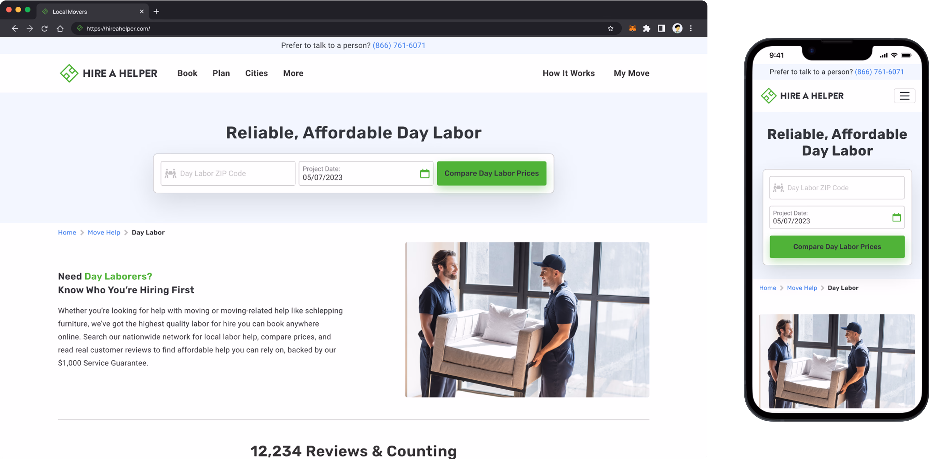
Rather than rebuild everything at once, we picked our highest-traffic landing pages (the geo pages) and started testing. Each variation swapped a different version of the CTA form. A few months in, we had real data telling us which directions were working.
2nd mvp
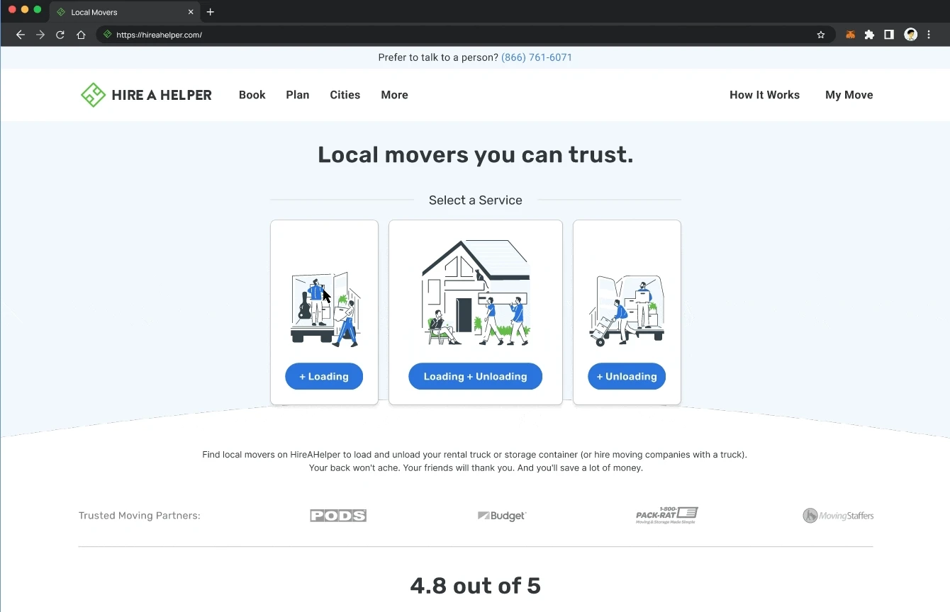
By 2023, it was clear HAH wasn't just a marketplace anymore. So we leaned into that, introducing service cards on the homepage, cleaning up the marketplace UI, and shifting the primary brand color from green to blue to feel more trustworthy.
That kicked off a new step-by-step conversion funnel. We A/B tested everything to make sure conversion held steady while we evolved the experience underneath.
3rd mvp
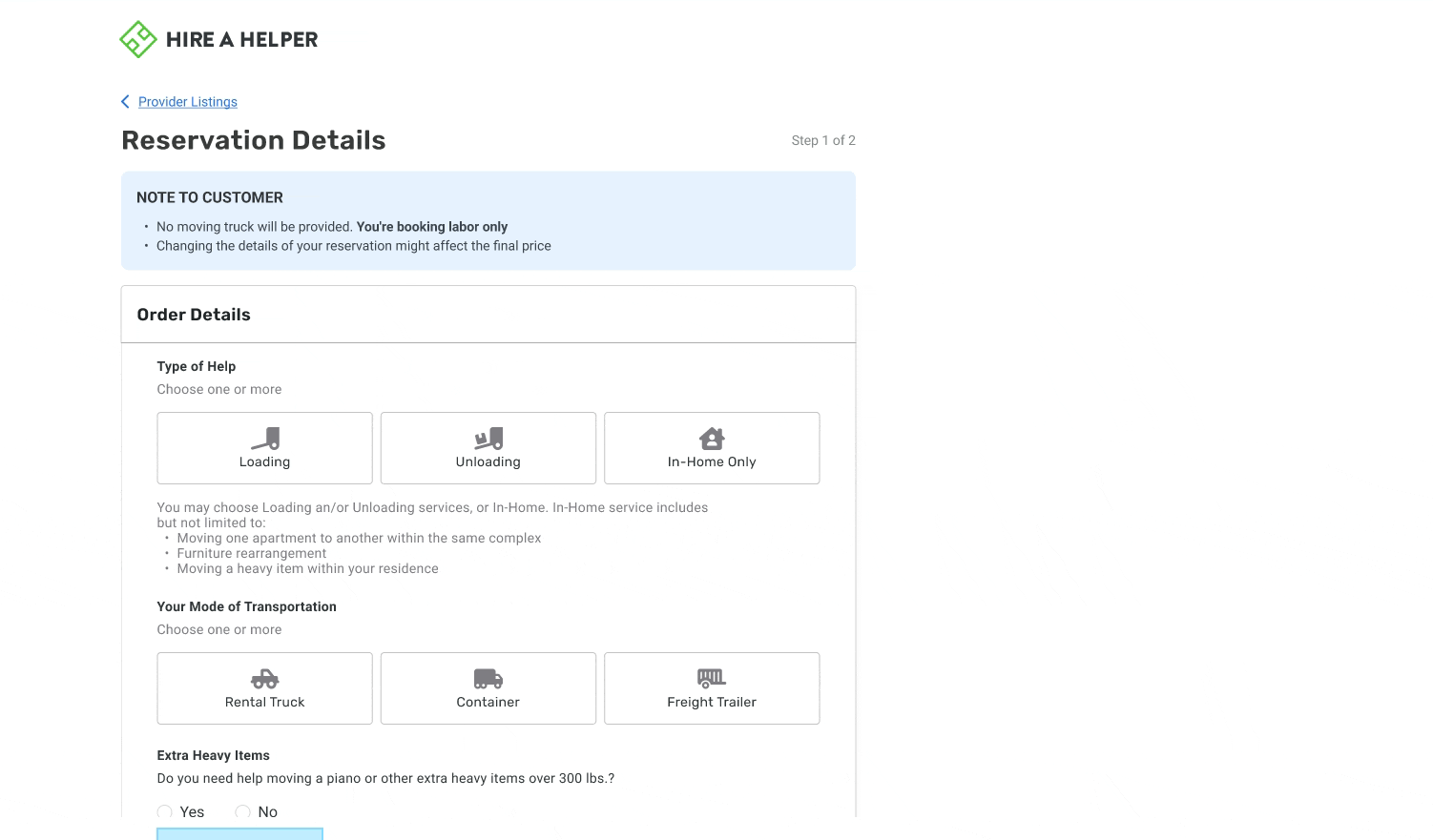
Now we're rolling out a more detailed but intuitive booking flow, closer to what our competitors offer, but with HAH as the primary partner instead of a third-party broker. Porch handles quotes and the move itself, end-to-end.
MVP2 tightened up the funnel by clarifying visual hierarchy and surfacing the move summary up front. But users still had to pick a mover themselves.
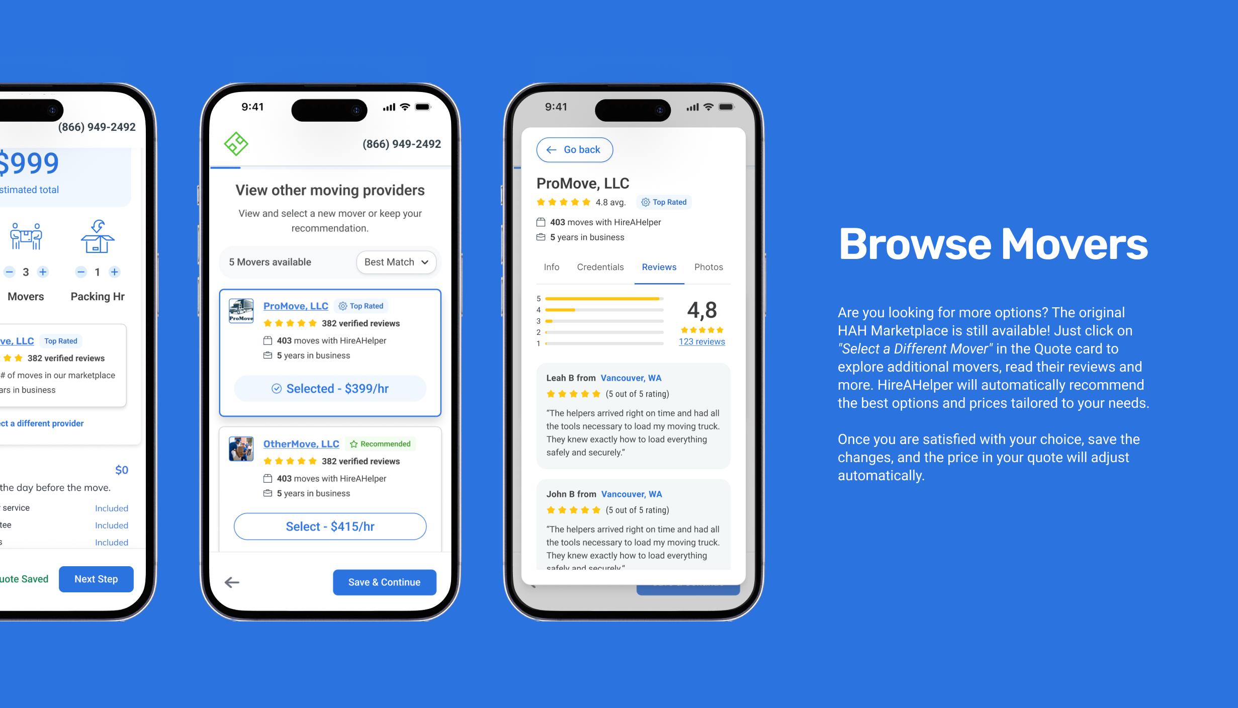
In MVP3, the funnel grew up: surfacing multiple quotes quickly and letting users customize the rest of their move, not just the mover. Personalized, but still a marketplace underneath.
The shift: less "browse a directory," more "here are the best options for you." HAH's algorithm, refined over years of customer data, does the heavy lifting on the pre-selection.
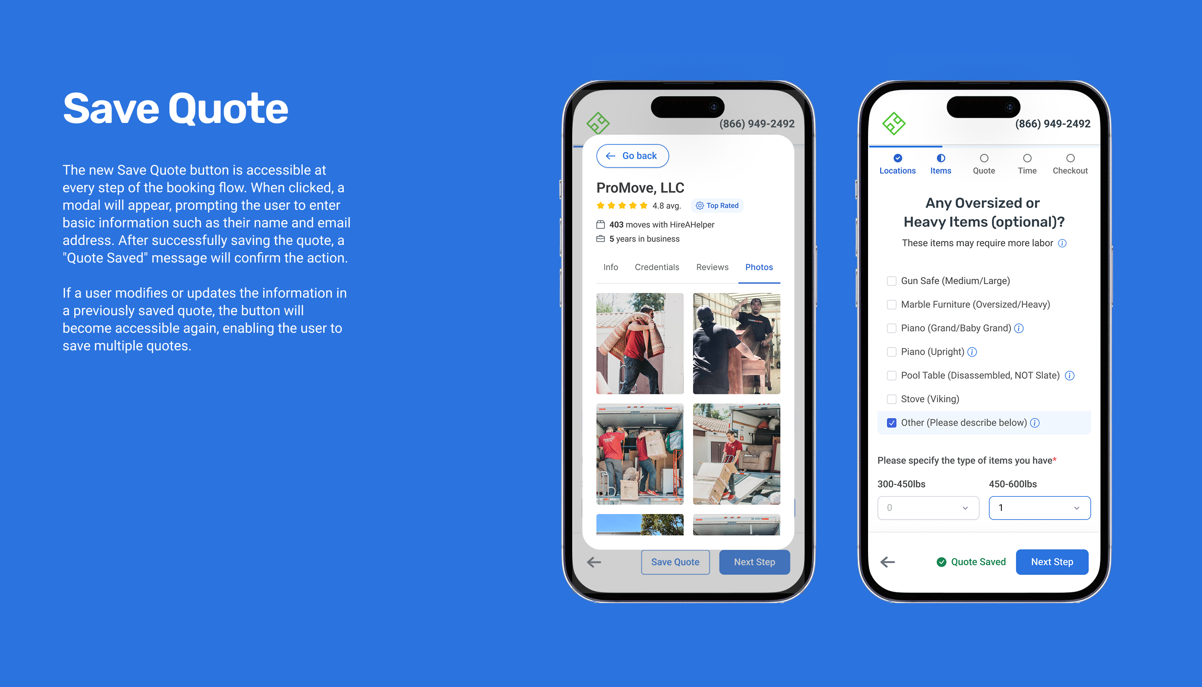
Users can save a quote at any step and get it emailed back, so they can come back later without losing progress.
The marketplace is still there. The algorithm pre-selects the best mover by default, but users can swap, compare reviews, and pick a different one at any time.
CMS & Design System
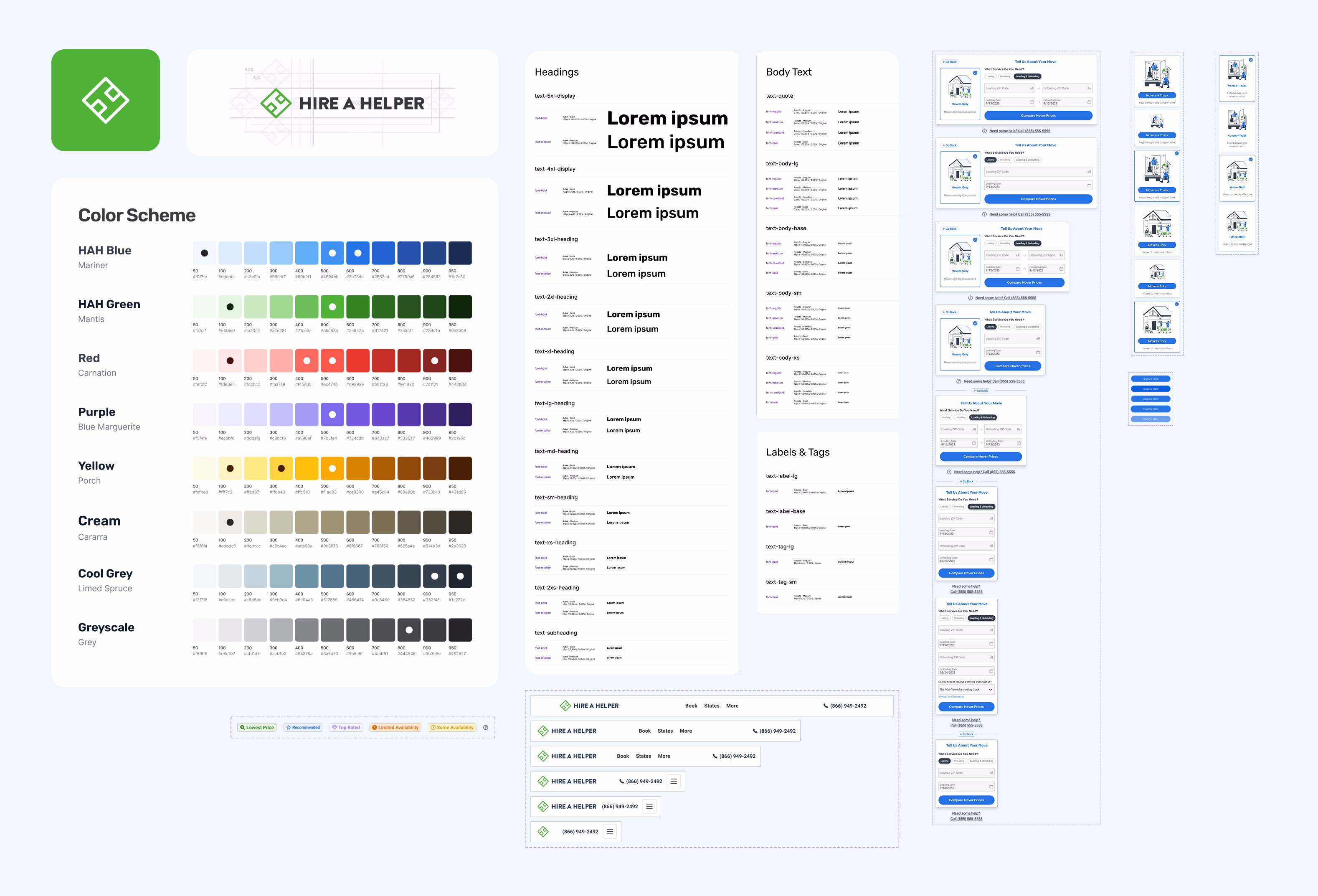
After enough rounds of testing, we built a proper design system for HAH, sitting on top of Bootstrap, powered by Flowbite. It gave the team a consistent, accessible foundation, and let us ship faster without breaking the brand every other sprint.
In parallel, we revamped the landing-page layer: A/B tested the geo pages, the homepage, the service pages, anywhere conversion was at stake. (Worthy of its own case study, honestly.)
HAH keeps evolving: flows shift, layouts change, the work continues. I wrapped up at Porch in August 2025, so this case study is a snapshot of the years I was part of it.
More HAH UI/UX work on Behance view publicationYears at HAH
A look back at the journey: from inheriting the green-era marketplace in 2022, through the blue-era funnel rebuild, into the quote-driven MVP3 and the design system that tied it all together.
The work shown here is a snapshot of what we built at Porch Moving Group: three MVPs of the booking flow, the brand refresh, and the design system that powered HAH, developed during my years there before I wrapped up in August 2025.
Since then, HAH has continued to evolve under new management and taken a different direction. What you see here reflects the design decisions, tradeoffs, and systems I was responsible for during that era, from the green-era marketplace through the blue-era funnel, into the quote-driven MVP3. I'm proud of what the team shipped.
Rodrigo Martínez · Porch Moving Group, 2022 to 2025
outro
Do I have your attention?