BACKCASE·MP · 04/10
PORCH MOVING GROUP·2024 TO 2025·MOVING SIMPLIFIED
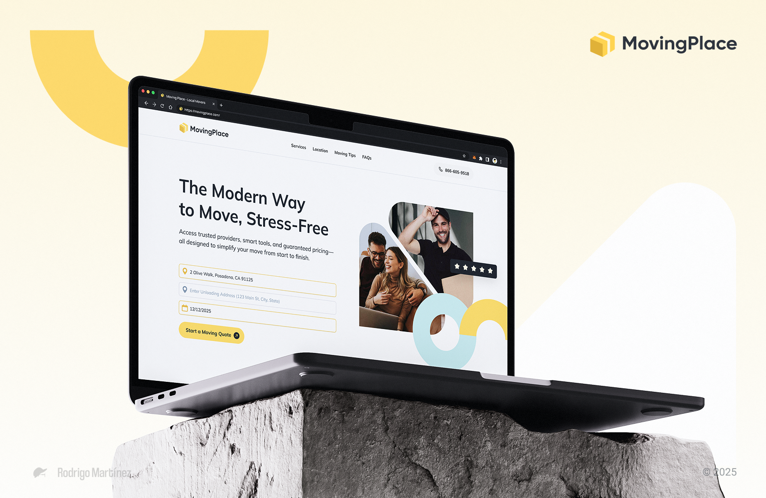
Redesigning The Moving Experience
Client
MovingPlace
Engagement
2024 to 2025
Role
UX Design, Creative Direction
Deliverables
Optimized Experience, CMS Dev, Design System
01 — Snapshot
MovingPlace was bleeding customers at every step of a journey people already dread. I spent eight days in research, then rebuilt the whole thing — brand, booking flow, CMS — in one go. Pricing up front, six clear steps, new cities live in hours.
02 — Goals & Challenges
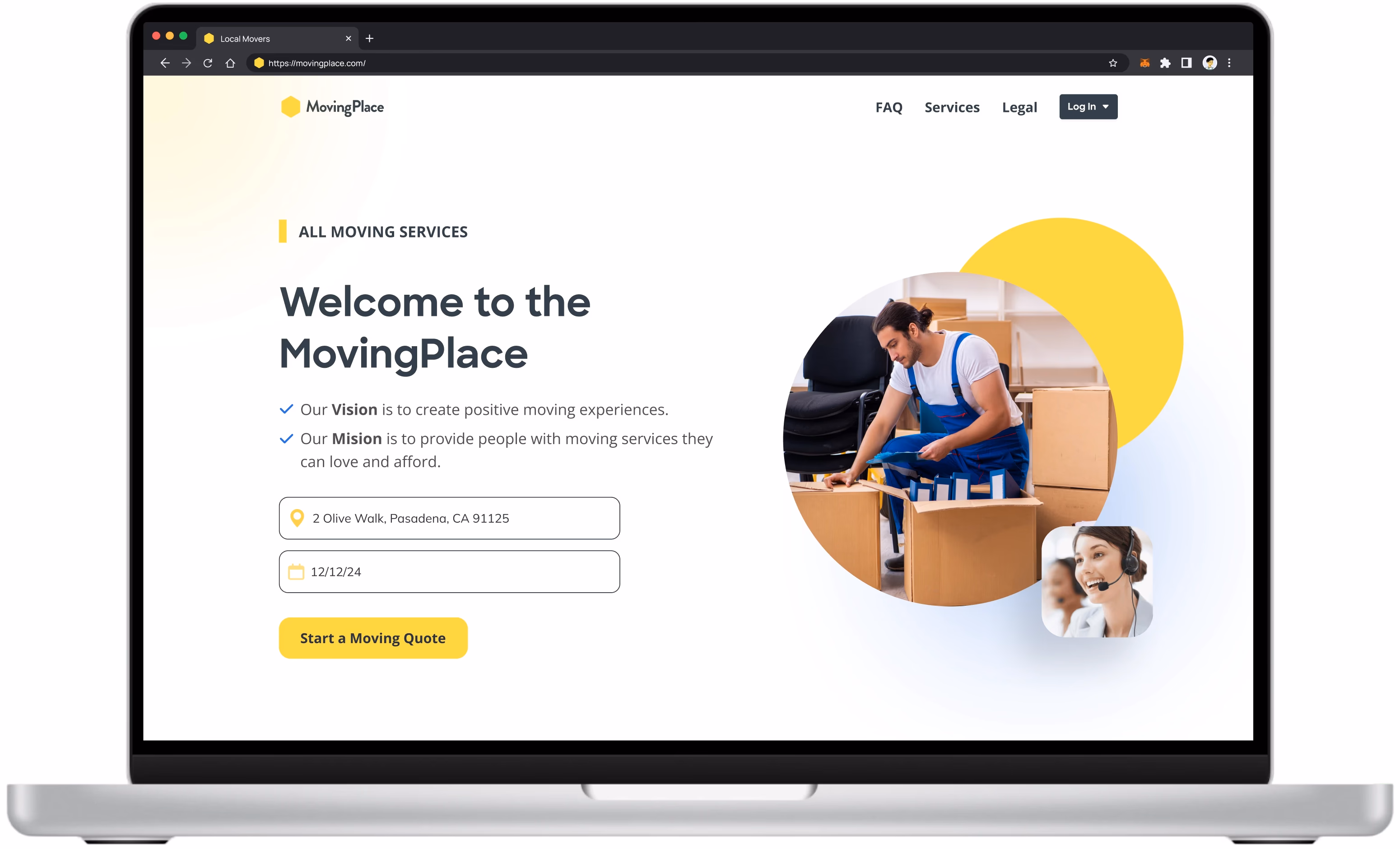
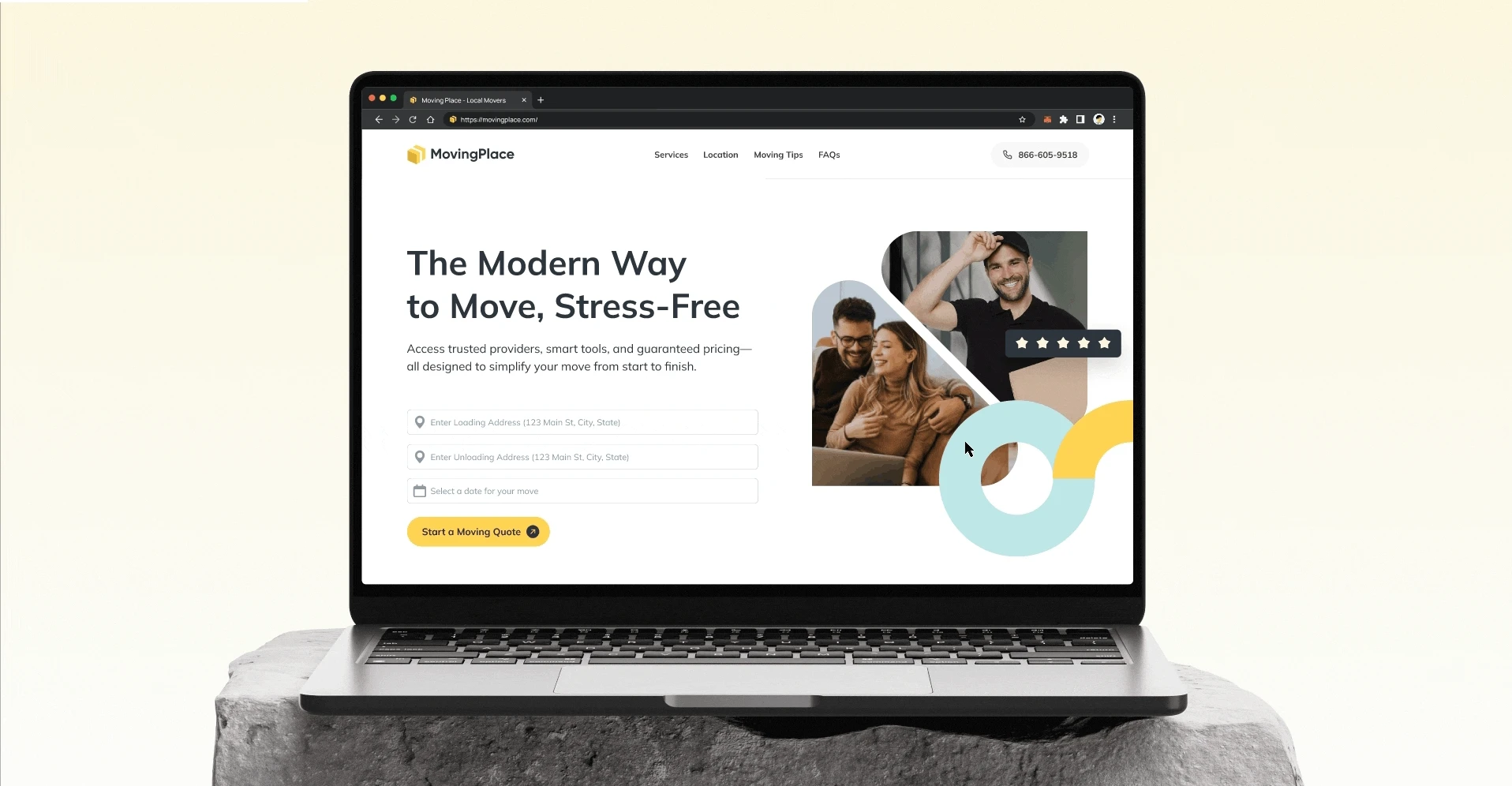
I joined Porch Moving Group to redesign MovingPlace — a platform stuck in the 2010s that was losing people at every step. The goal: make it trustworthy enough to win the booking on the first visit.
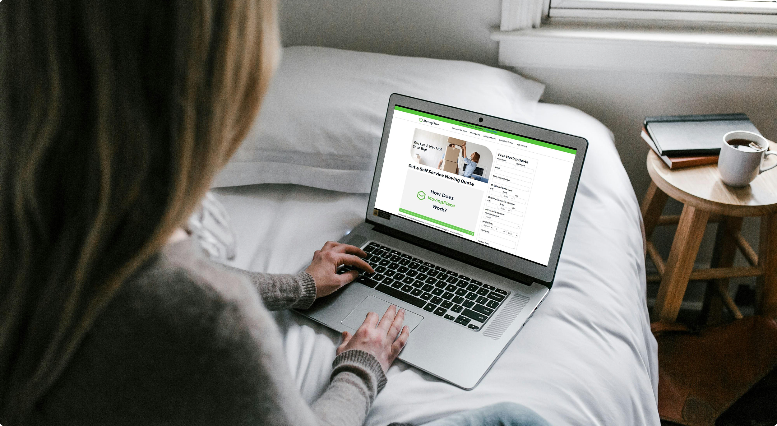
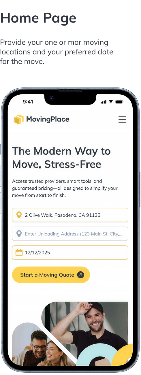
The old form asked for a wall of personal details just to get a quote — then made you wait for someone to call you back. In 2024, that's not how people expect to book anything.
03 — Research & Analysis
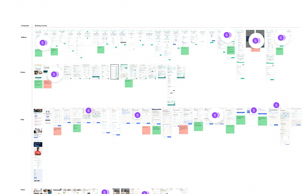
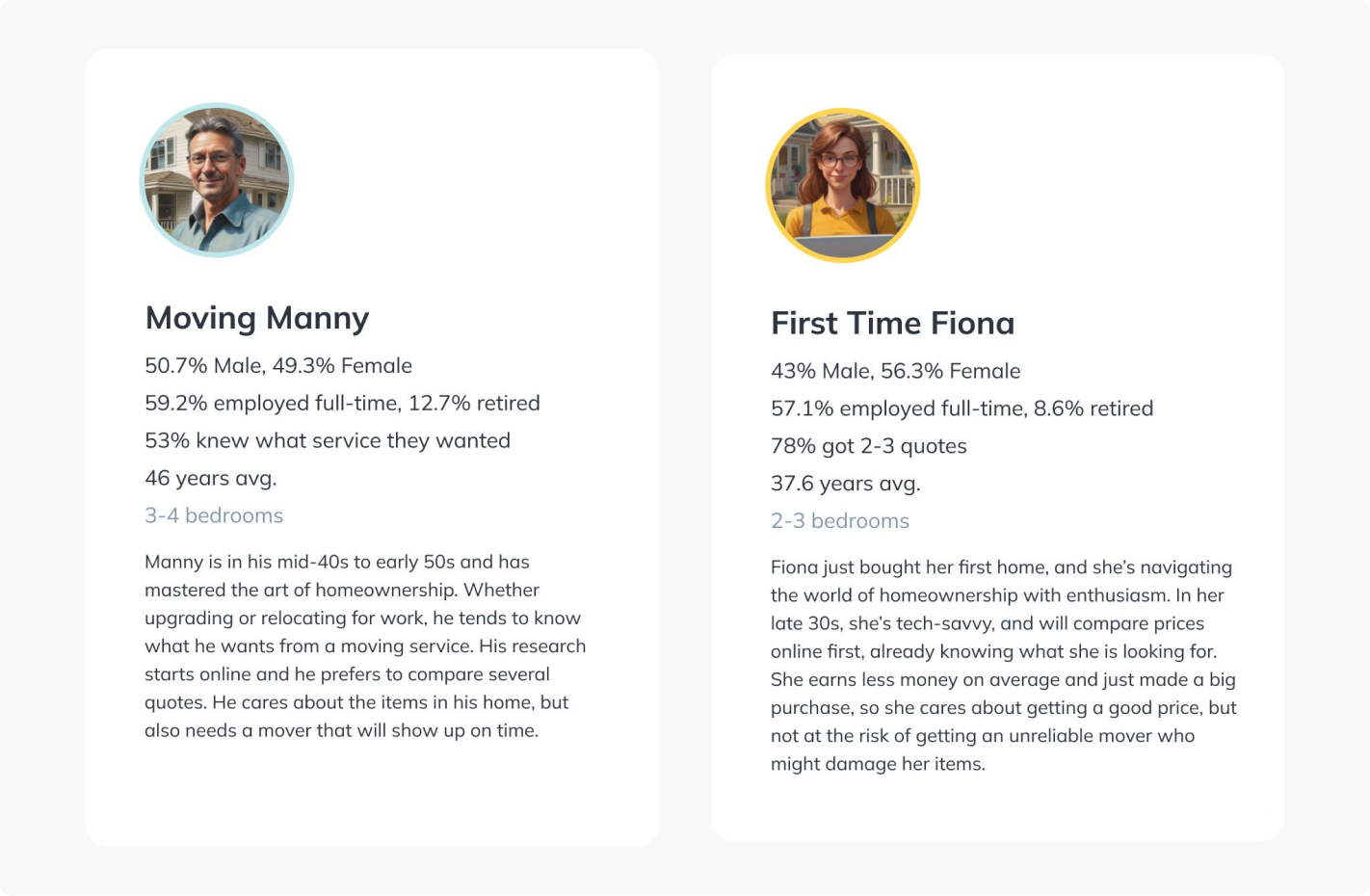
Before opening Figma, I spent eight days on research — 30+ competitors, a consumer survey, and interviews with people who'd used a full-service mover in the last six months.
The finding was pretty obvious in hindsight: companies that showed pricing upfront converted. Companies that hid it behind a form didn't.
04 — Strategy & Exploration
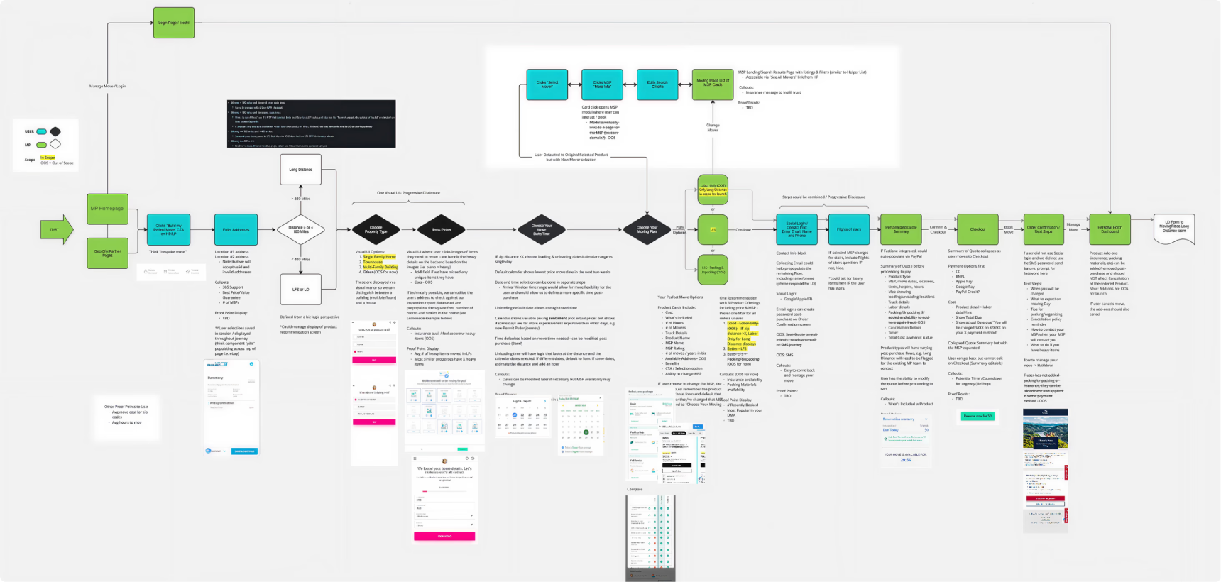
Six booking journeys drafted. Three days of whiteboarding. The first thing to lock down wasn't the brand — it was the logic. What service type? What distance? What does the quote get built from?
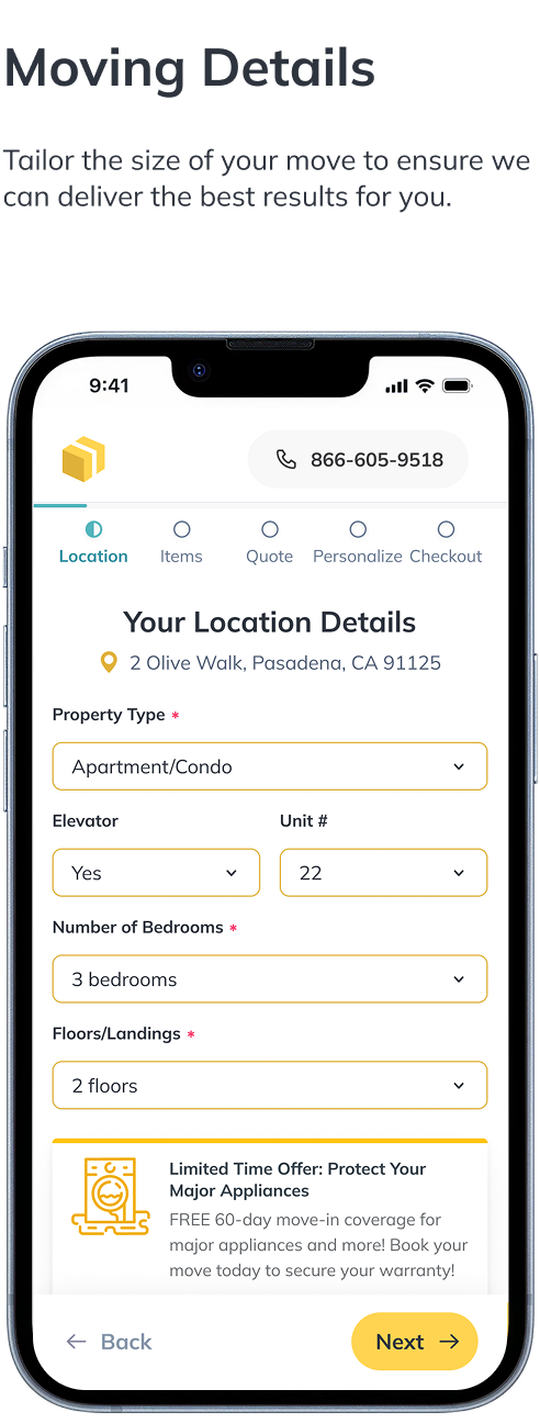
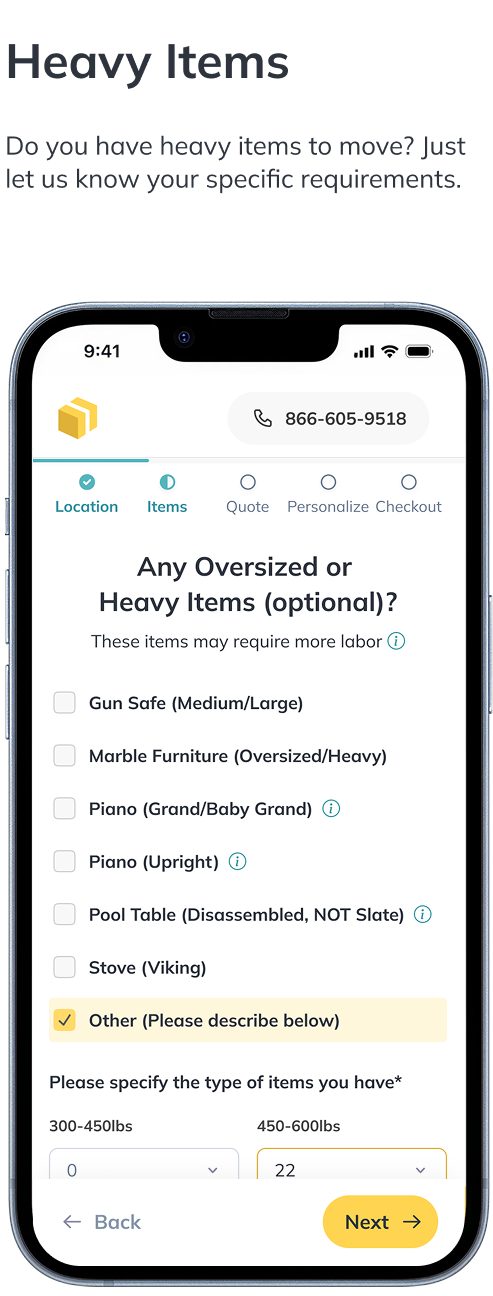
Moving has three distinct jobs to do: labor-only for people handling the truck themselves, full-service for hands-off customers, and long-distance for anything past 40 miles. Each one has different questions, a different checkout path, and different risk. We mapped all three and found the branches where a single flow could handle all of them — progressive disclosure, showing complexity only when the user actually needed it.
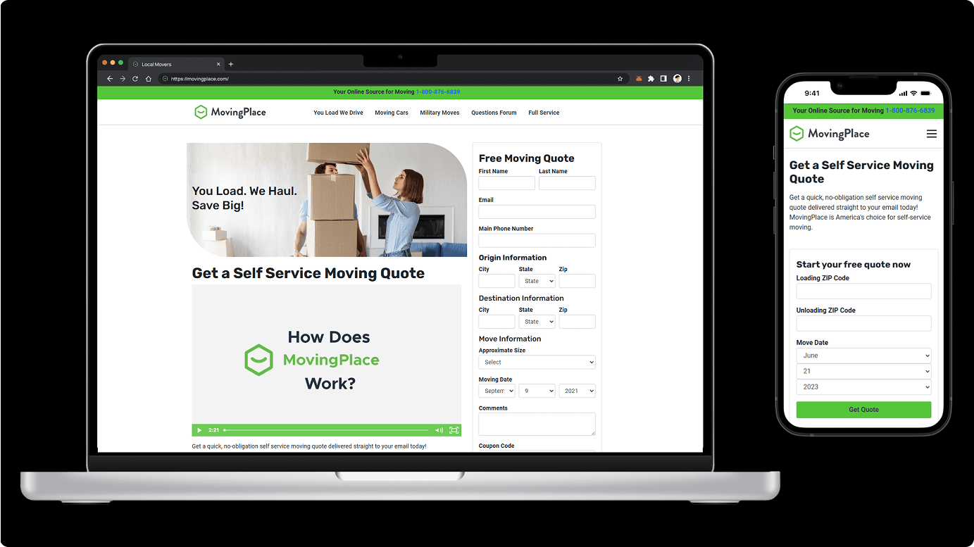
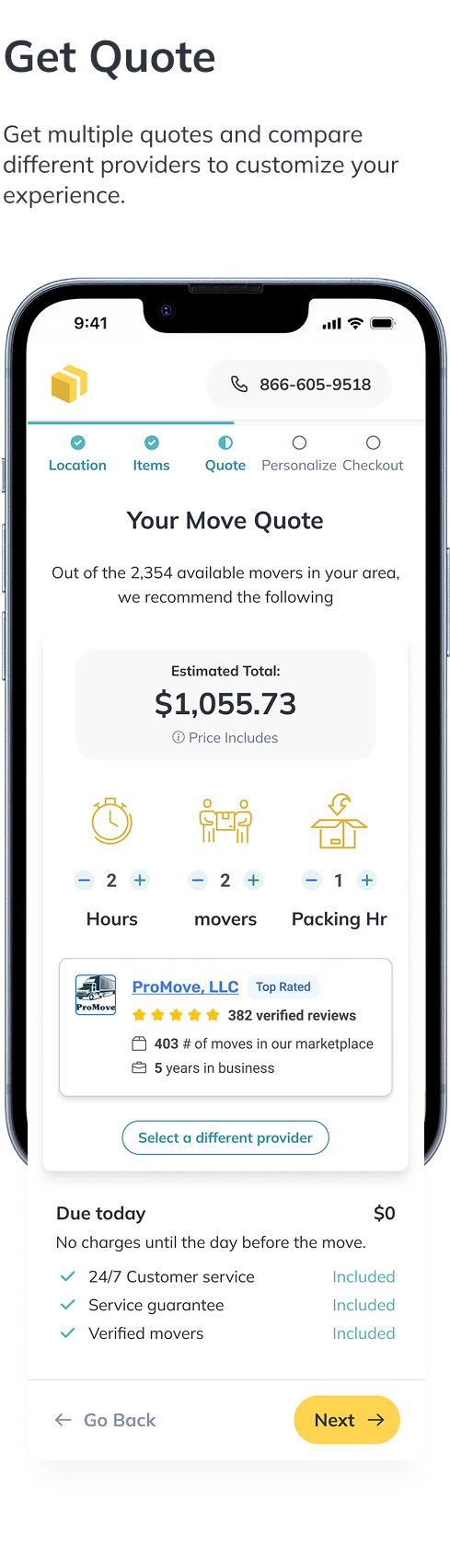
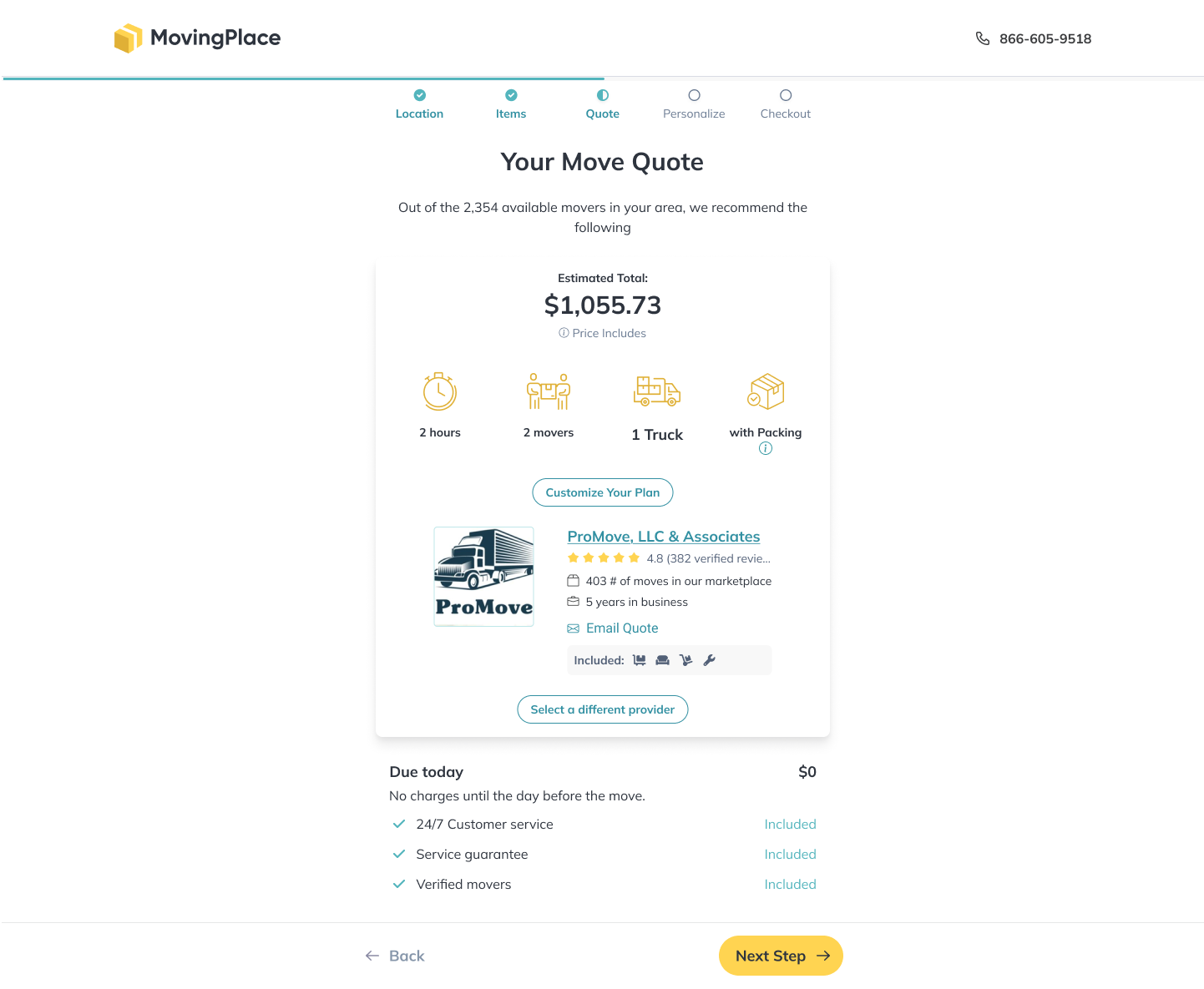
Pricing up front. Every draft that buried the price behind a form lost people. The winning flow puts a personalized quote in front of users as early as possible — addresses first, service type second, pricing third — so they know what they're getting into before they hand over personal details.
With the flow locked, we explored two directions for the brand to wrap around it.
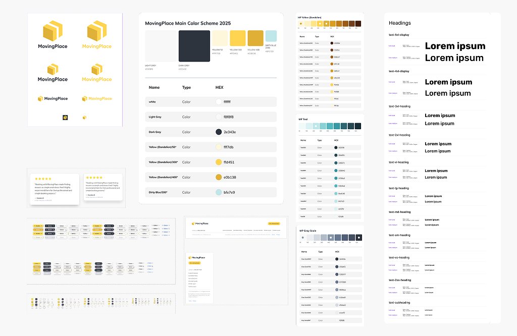
05 — Brand Identity
Leadership made the call to outsource the rebrand to a specialized agency — which paused our UI work while they ran consumer research, explored concepts, and finalized the identity. The vibrant yellow palette, the logotype, the motion language — all came from that process.
Credits: Veronika Zamecnikova.
06 — Platform Identity
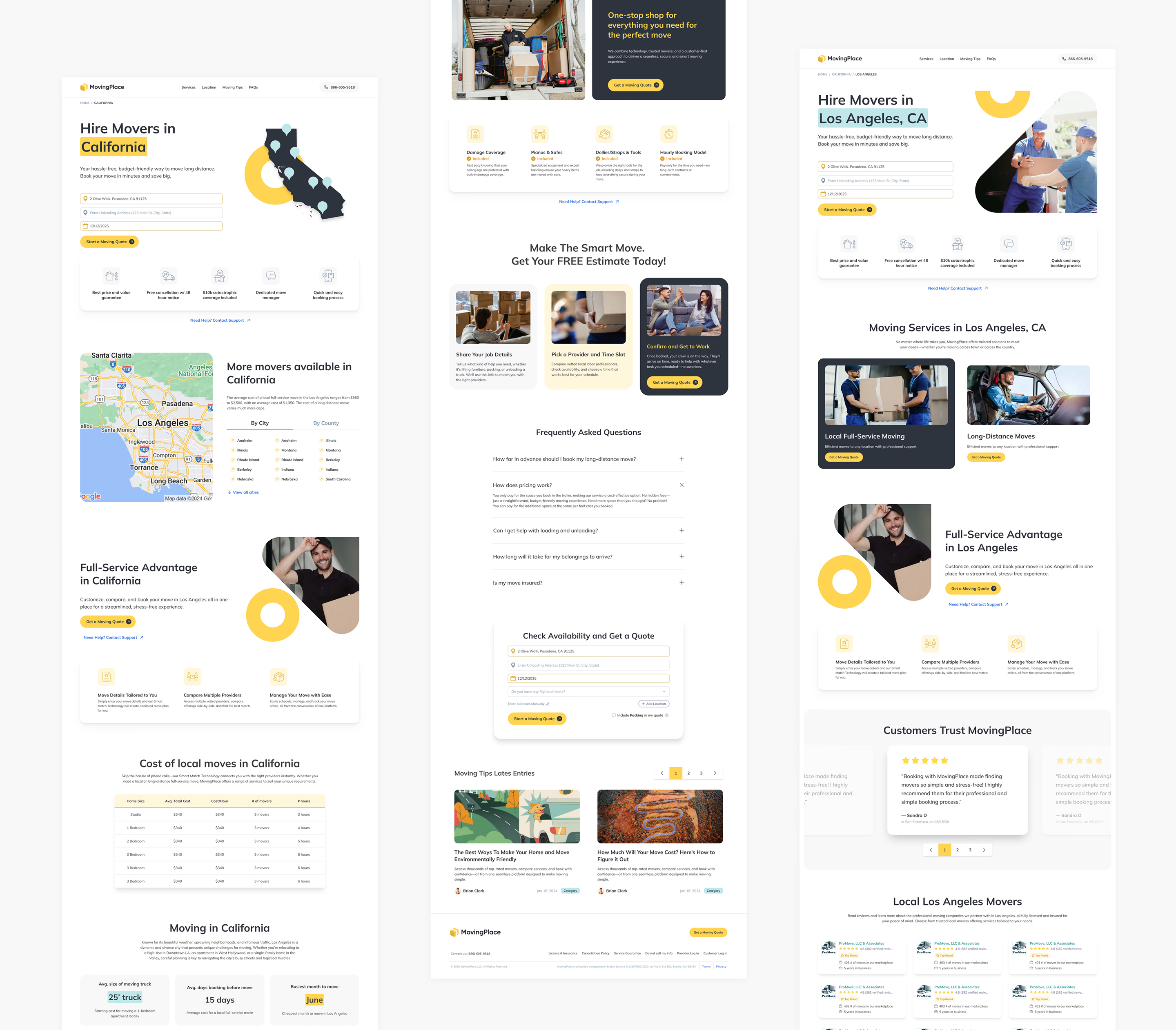
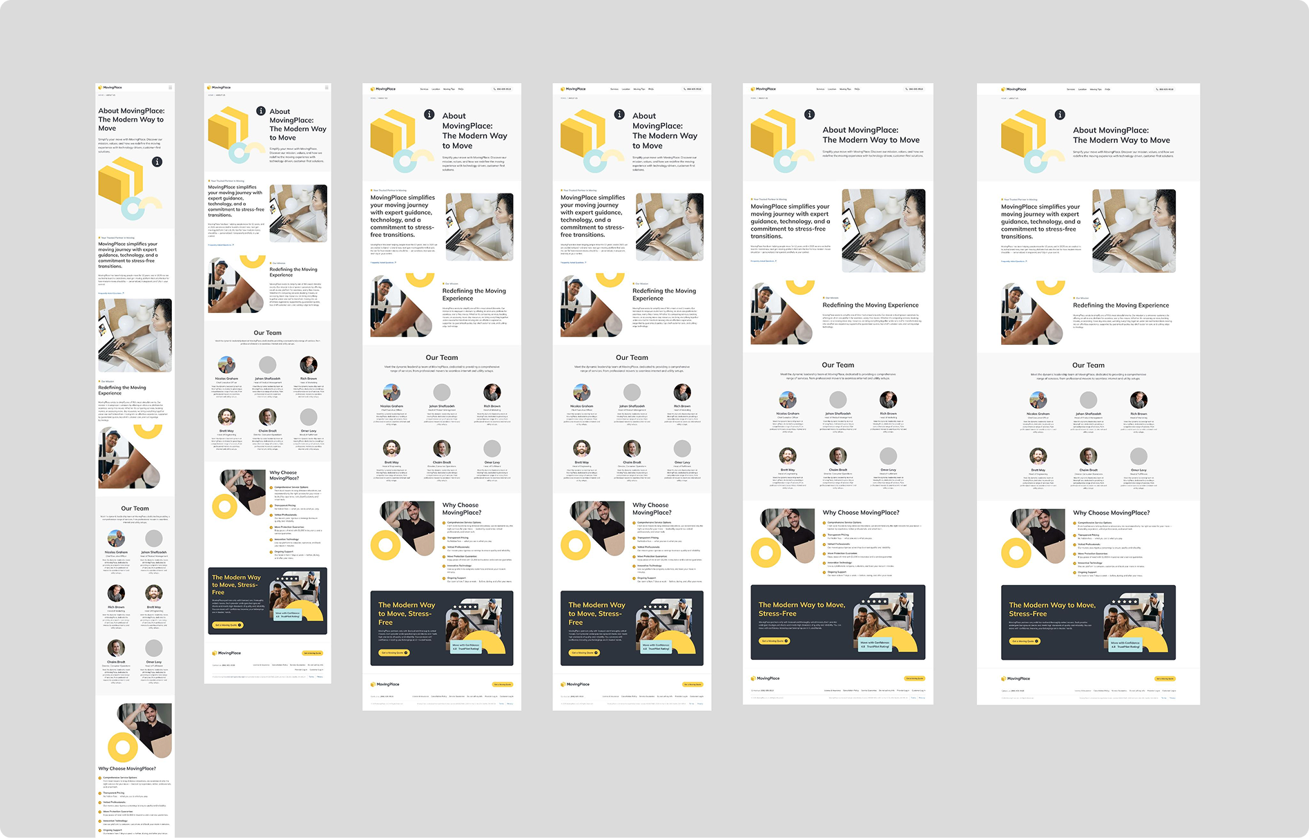
While designing the booking flow, I collaborated closely with the marketing and product teams to elevate every aspect of the website's UI and UX — homepage, blog, geo-targeted landing pages, and various subcomponents — all scalable and ready to plug into the CMS.
With the brand book finalized, we filled the pre-designed templates with the new tokens and assets. The outcome was a modern, cohesive experience tailored to the target customer: trustworthy on first impression, clear on what MovingPlace delivers.
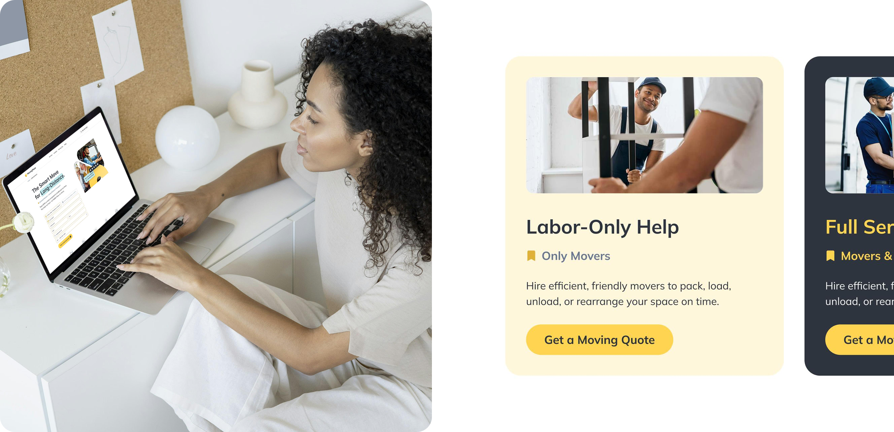
07 — UX/UI Design
We developed and refined a new booking flow, testing it with HireAHelper while MovingPlace was being prepared. Once final designs received approval, we observed its performance compared to its sister company, HAH. Both platforms now utilize the same booking funnel structure.
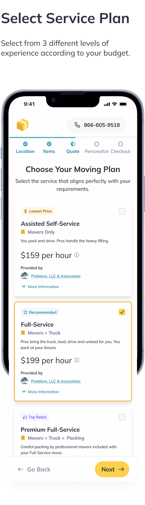
While most competitors provided a single quote after multiple steps, we aimed to deliver a more comprehensive and flexible experience by offering three distinct service tiers — Good, Better, Best. This aligned with our diverse customer personas and established our competitive differentiation.
Completion rate went from 38% to 80% in the first month. But the number I actually cared about was the 40% drop in 'how does this work' support tickets.
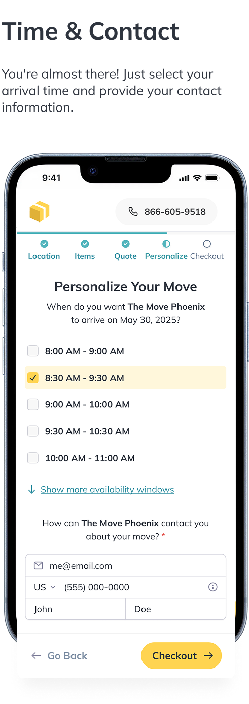
Tested two customization patterns: a modal that kept things compact but hid options behind a click, and an inline editor that put everything in context. Against all odds — and against most of the team's bets — Version B, the inline editor, came out on top: higher confidence scores in testing and more completed quotes.
One thing worth calling out before moving on: the subtle differences you'll notice between the screenshots and flow examples throughout this case study aren't accidents. They reflect the rolling A/B tests that ran in between the big design changes — every time we landed on a winner, we'd test smaller variations on top of it (copy, layout, defaults, labels) to keep tightening the decision. The shipped product is the cumulative result of those micro-iterations, not any single redesign.
08 — CMS & Design System
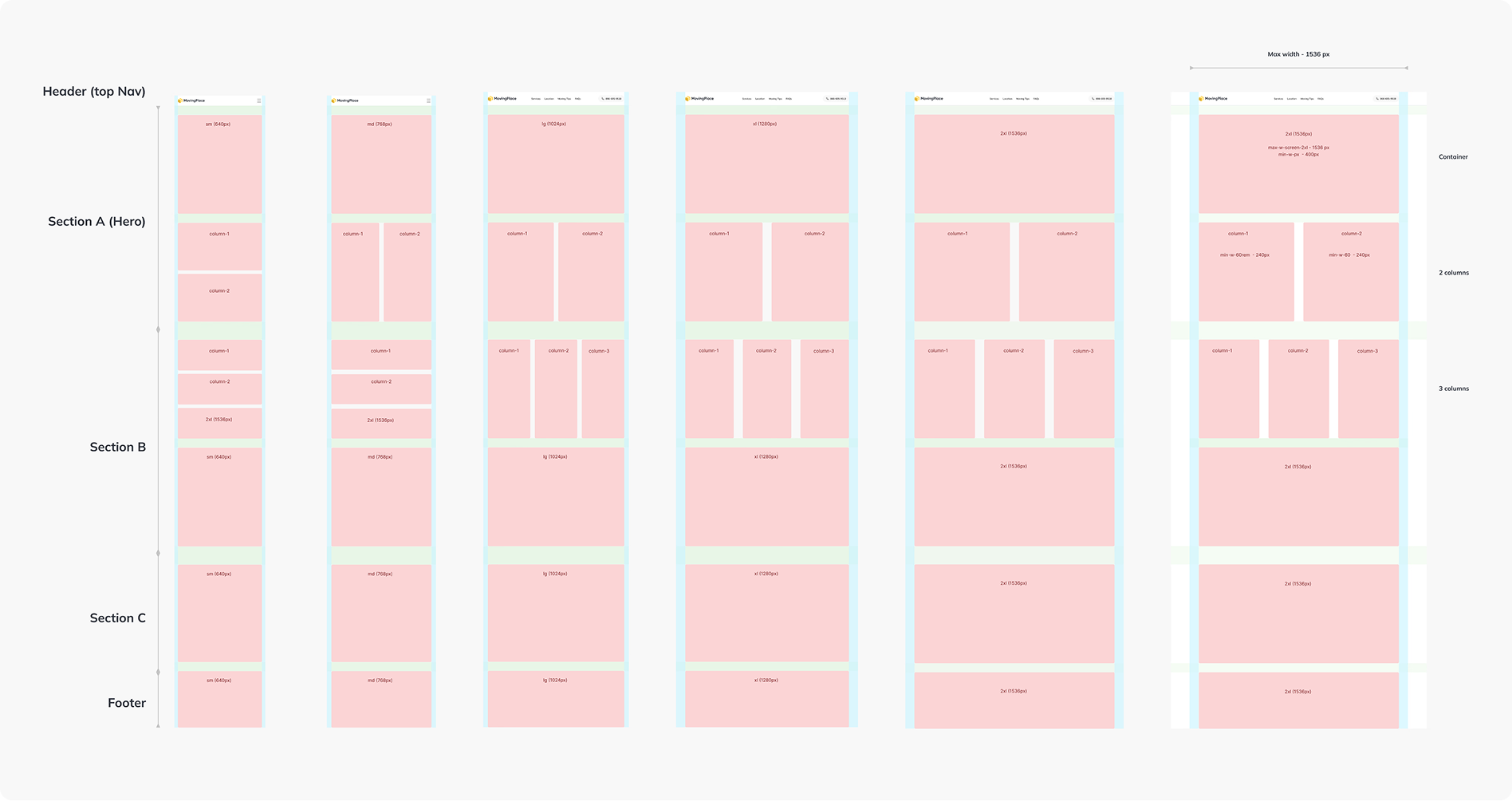
Once the booking flow was locked in, we turned to the design system. Tailwind gave us a solid base — tokens and components we could reuse across the whole site, not just checkout.
The bigger play, though, was the front site. We'd already wireframed a stack of templates early on — city pages, state pages, service pages — all built around SEO and internal linking.
From there we set up a flexible CMS-driven modal system so we could spin up and manage these templates without friction — something that could scale with the business.
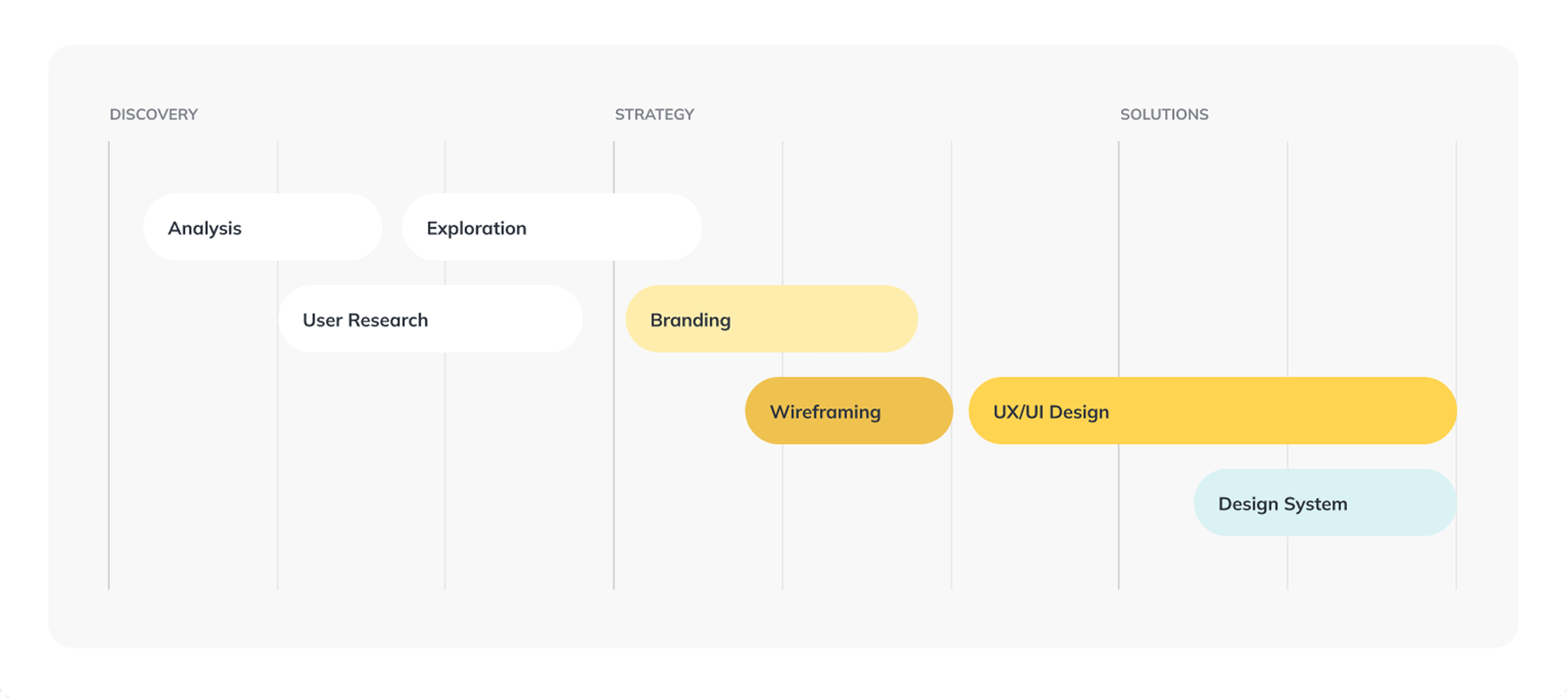
Across the project, the work moved through three phases — discovery, strategy, and solutions — with each stream overlapping the next. Research informed branding, branding fed wireframing, wireframing rolled into UX/UI, and the design system grew underneath all of it.
The work shown here is a snapshot of what we built at Porch Moving Group — the booking flow, brand system, and CMS framework — developed during my time there before I departed in 2024.
Since then, MovingPlace has evolved under new management and taken a different direction. What you see here reflects the design decisions, tradeoffs, and systems I was responsible for during that era. I'm proud of what the team shipped.
Rodrigo Martínez — Porch Moving Group, 2022–2024
outro
Do I have your attention?