Design System, Responsive Templates, Blog Redesign, PR Strategy
01 — Snapshot
The work at a glance.
RapidGarden POS is part of the RapidPOS family, the point-of-sale platform serving specialty retail like garden centers and gun stores. Strong product. Loyal customers. But the site looked stuck in 2008, the forms were full of spam, and traffic was bouncing before it had a chance to convert.
Garden was their highest-leverage vertical: 200+ loyal garden centers already in the customer base, 12,000 in the addressable market, and a CEO who'd already drawn a line in the sand. My job was to lead the UX optimization that turned that bet into pipeline.
+157%
MQL volume
Best month on record after the relaunch.
+62%
Organic form conversion
Validating the new templates and page relevance.
+90%
YoY engagement
Across the entire site.
-55%
Cost per lead
From peak levels, off the back of cleaner data.
02 — Goals & Challenges
Strong product, broken destination.
RapidGarden had a real business problem hiding behind a digital one. Sales was drowning in spam leads. The marketing dollar wasn't converting. And the brand felt nothing like its parent company. Before we could grow the funnel, we had to fix the destination people were landing on.
“If we crush it at Specialty Grocery and Garden, that's all the growth we need.”
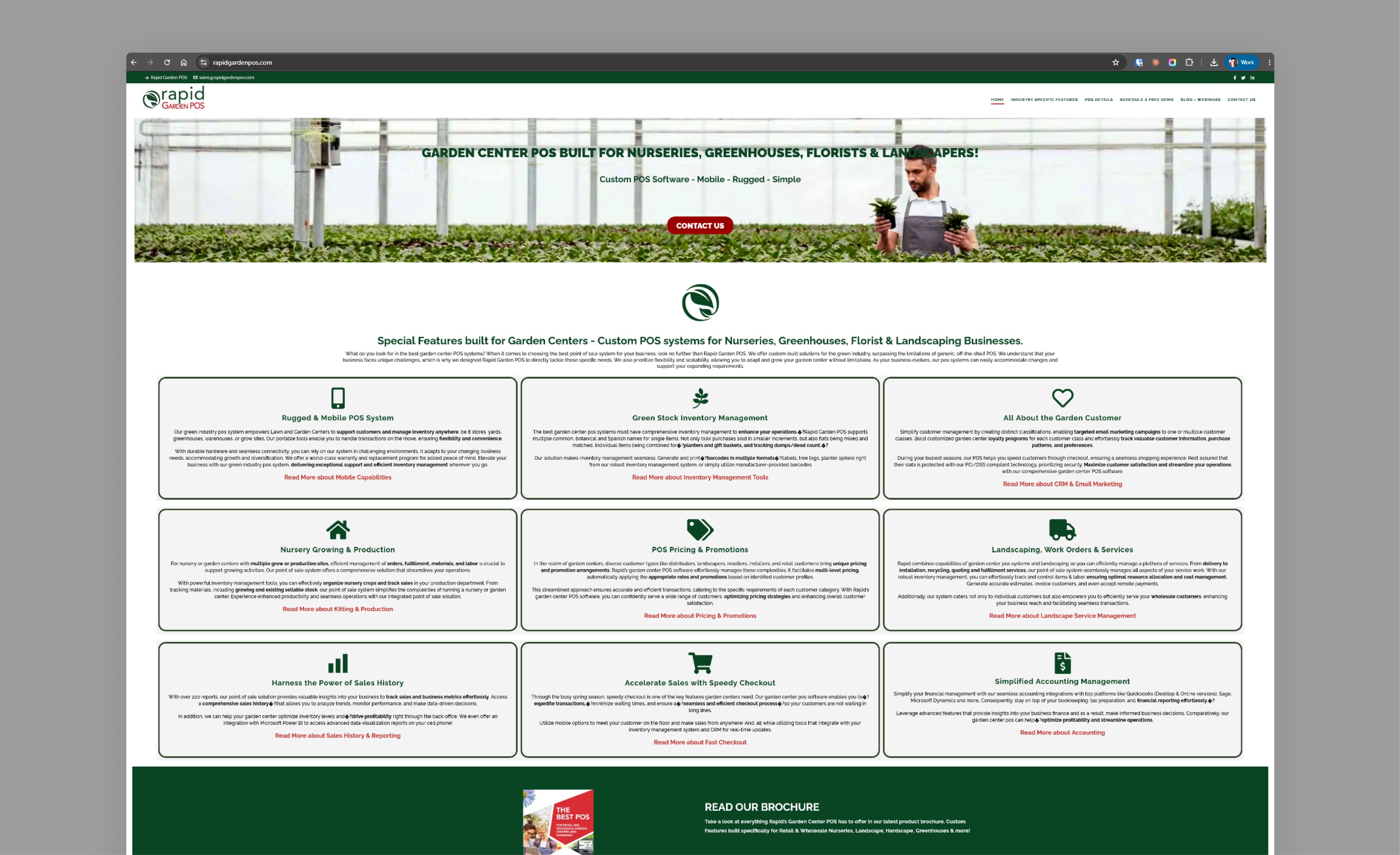
The site we inherited: heavy page loads, inconsistent UI, and a brand disconnected from RapidPOS.
Pain points
Spam-prone forms polluted the pipeline and frustrated sales with unqualified leads
Generic user journeys: paid and organic traffic both landed on unoptimized pages
Outdated UI that resembled a 2008 WordPress theme, with major visual inconsistencies
Heavy page loads created friction before users could even consume the content
Brand disconnect from RapidPOS, failing to leverage the parent company's authority
Three objectives
🌱
Optimize the destination
Stop chasing more traffic. Convert the traffic we already had.
📐
Design with depth
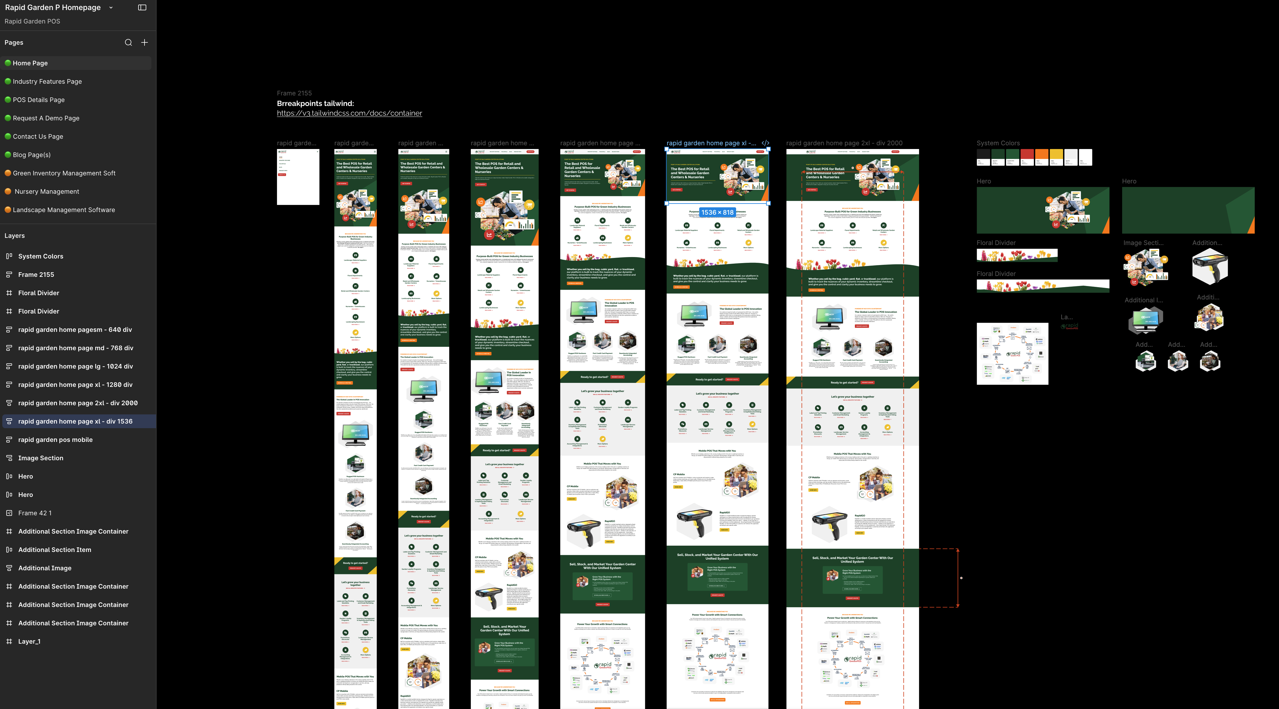
Templates designed with the team, specified end to end at every breakpoint.
🔗
Align the ecosystem
Make RapidGarden feel like a natural extension of RapidPOS, not a separate brand.
03 — Research & Discovery
Where trust was breaking.
Before redesigning anything, I wanted to understand why the site wasn't converting. We didn't have the budget for formal user interviews, but the marketing data was already sitting in front of us. So was the answer.
Three signals kept showing up. All pointing at the same problem: the old site was breaking trust before users could even start evaluating the product.
Signal 1: First impressions didn't hold up
The site looked stuck in 2008. Heavy page loads, inconsistent visuals, a brand that felt nothing like its parent company. For a buyer landing fresh, that's a credibility gap before they read a single word.
The marketing side told the same story. Only 6% of organic traffic was non-branded. The site wasn't earning new visitors who didn't already know the company. No discovery engine, because there was nothing on the page worth discovering.
6%non-branded organic traffic
200+existing garden center customers
12,000TAM in the vertical
The old blog spoke product features in a dated layout. Search data said buyers were looking for help with operational pain.
Signal 2: The forms broke the contract
A meaningful chunk of form submissions were spam. From the user side, a leaky, friction-heavy form sends a clear message: this company doesn't have its act together. From the marketing side, the same spam was poisoning Google's conversion signals, training campaigns to chase the wrong audience and feeding sales leads they couldn't trust.
Same problem, read two ways. The fix wouldn't live in the form itself, it would live in the trust the page earned before users got there.
Signal 3: The pages didn't speak the buyer's language
Search queries told us users weren't shopping for "POS software." They were searching for operational pain: inventory overflows, dead stock, checkout speed, plant label printing. Real problems, in their own words.
The site spoke product features. That's a trust gap before it's a conversion gap. If you can't show me you understand my problem, I'm not going to trust you to solve it.
04 — Strategy
Stop chasing traffic. Build a destination worth arriving at.
Once the trust gaps were obvious, the strategy was obvious too. We shifted the work from "drive more traffic" to "earn the visit." Every touchpoint had to do its job before we asked users to convert.
Four moves, in order
A new design system aligned to the RapidPOS ecosystem, so RapidGarden could borrow the parent brand's authority
Responsive templates designed with the team under the new identity, each one shaped around a specific vertical
Breakpoint-level depth across every template: desktop, tablet, mobile, all specified end to end
Blog redesign with a new post template and a refreshed PR strategy, so content actually compounded
05 — UX/UI Design
Designing every surface with the team.
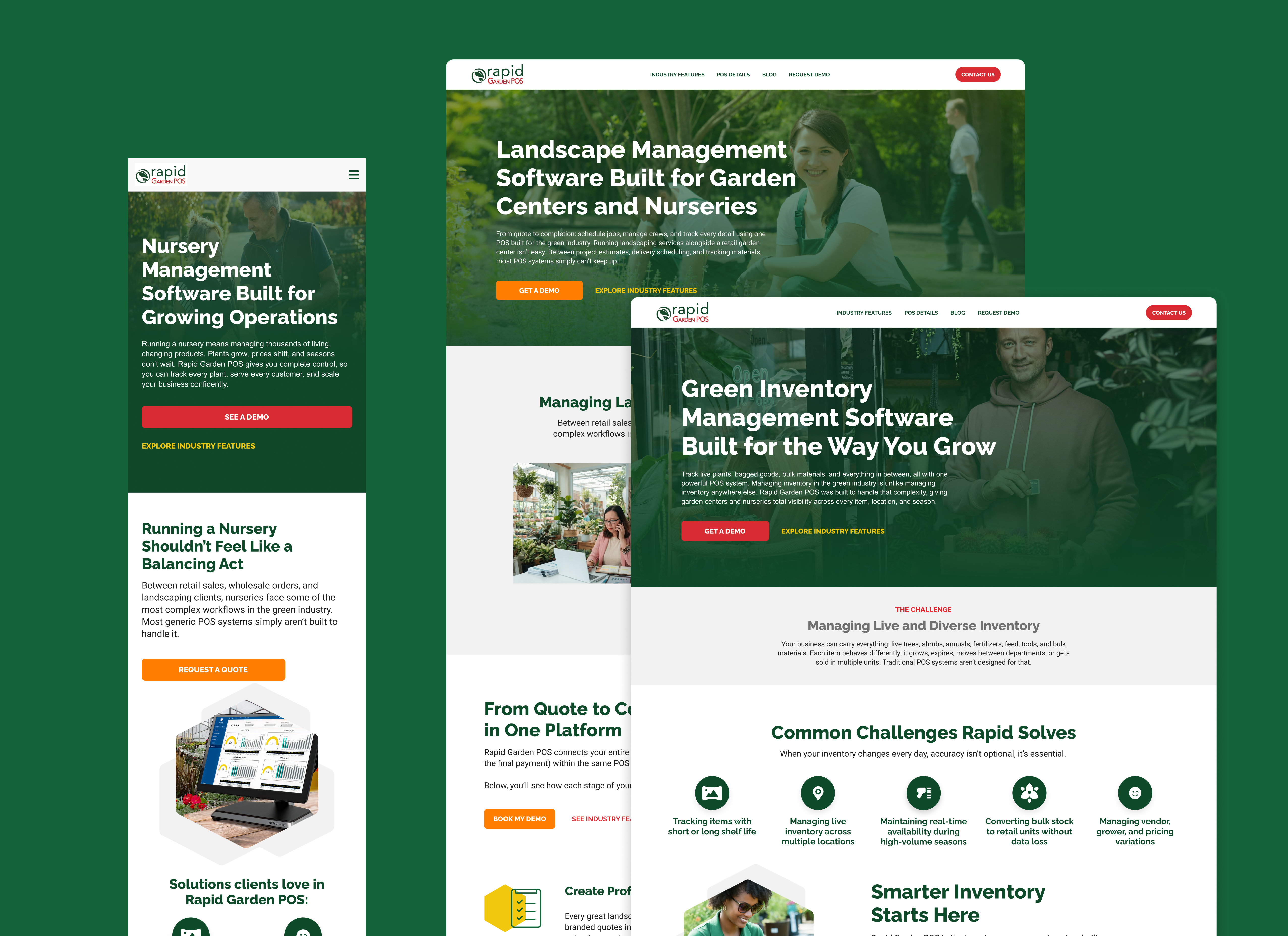
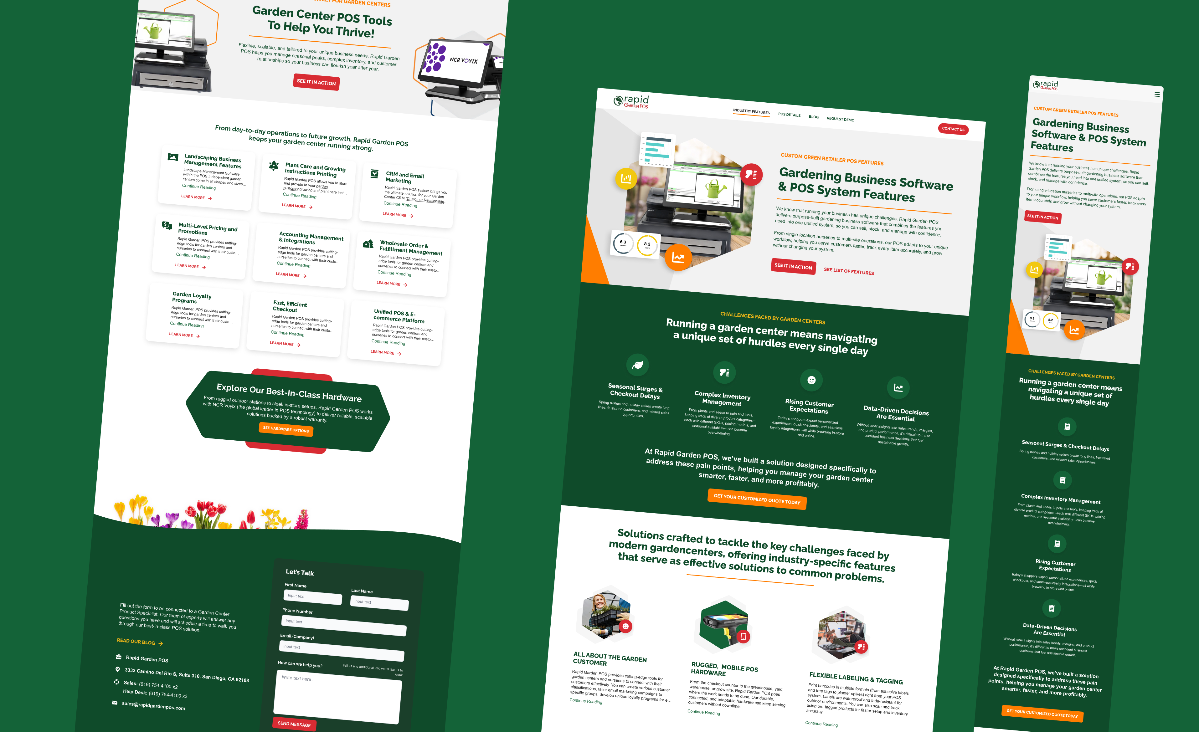
Ecosystem alignment
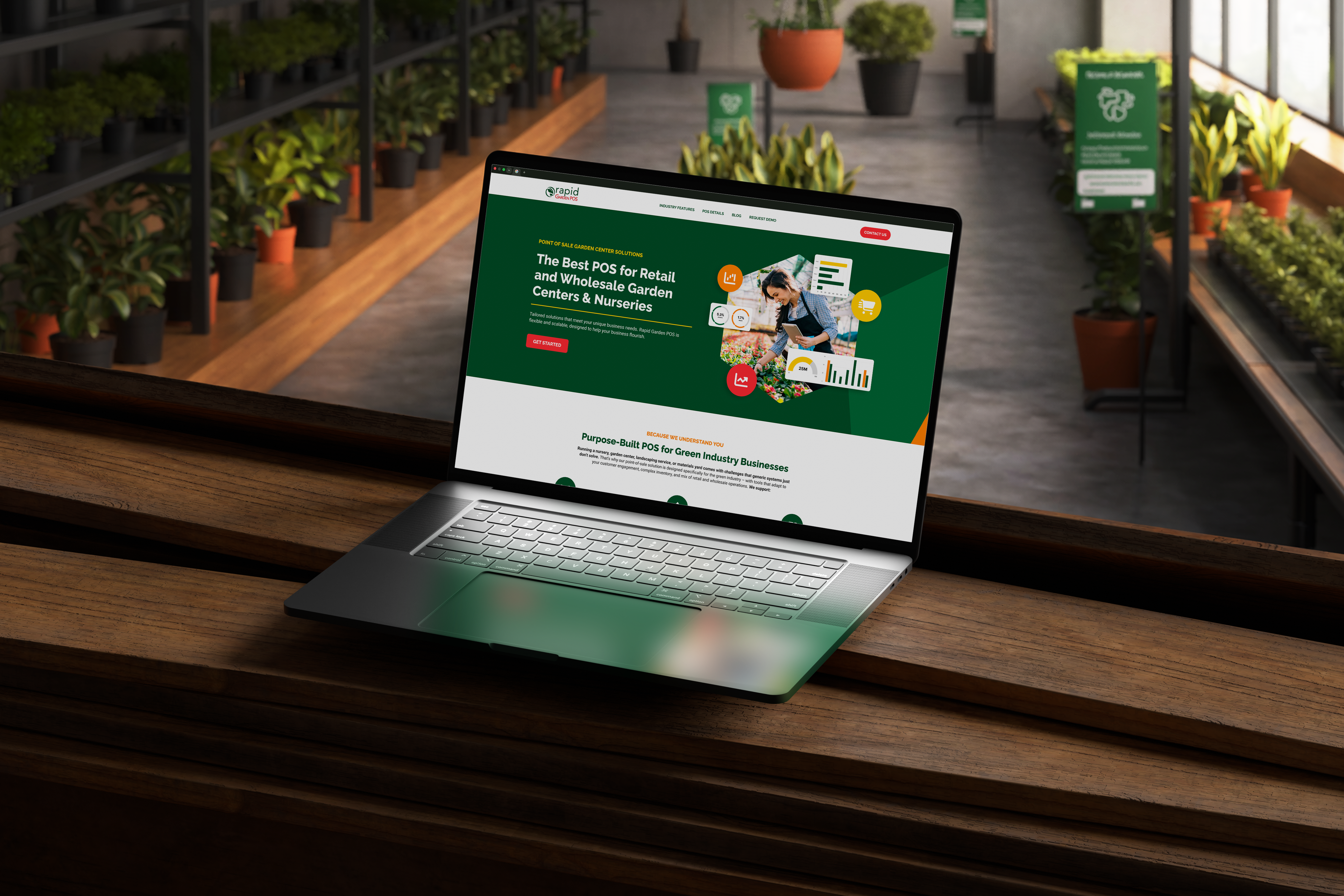
Trust starts with first impressions, so we fixed the brand disconnect first. The team and I pulled apart the parent RapidPOS site and built a cohesive identity for RapidGarden that felt like a natural extension of the ecosystem. Same visual language. Same authority. Same trust signals.
Then we used it to overhaul the site end to end. Out went the 2008-era theme. In came sub-100KB WebP imagery and a modernized UI that loaded fast and let the content actually land.
1 / 2
RapidGarden as a natural extension of the ecosystem.
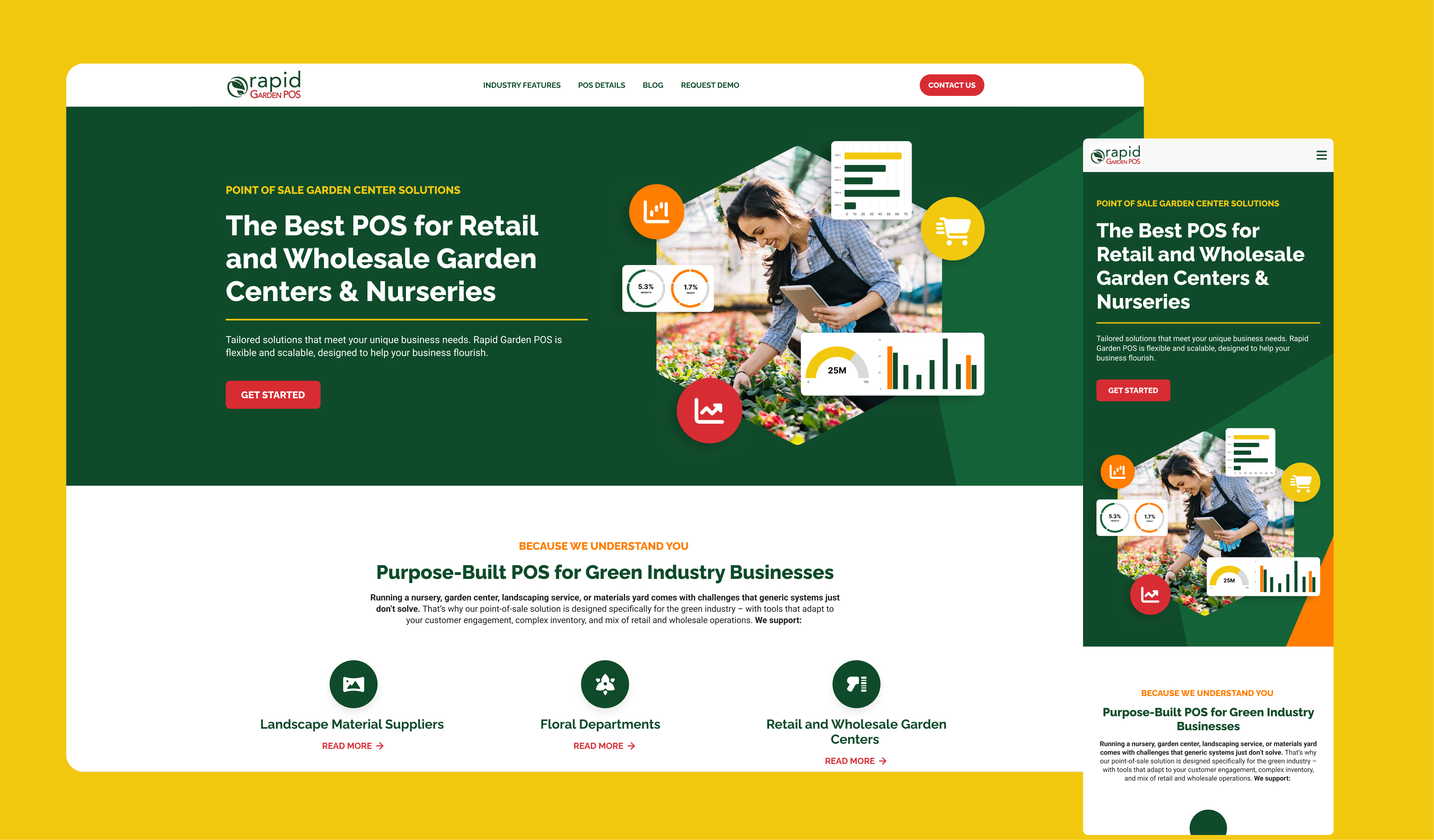
Templates with breakpoint-level depth
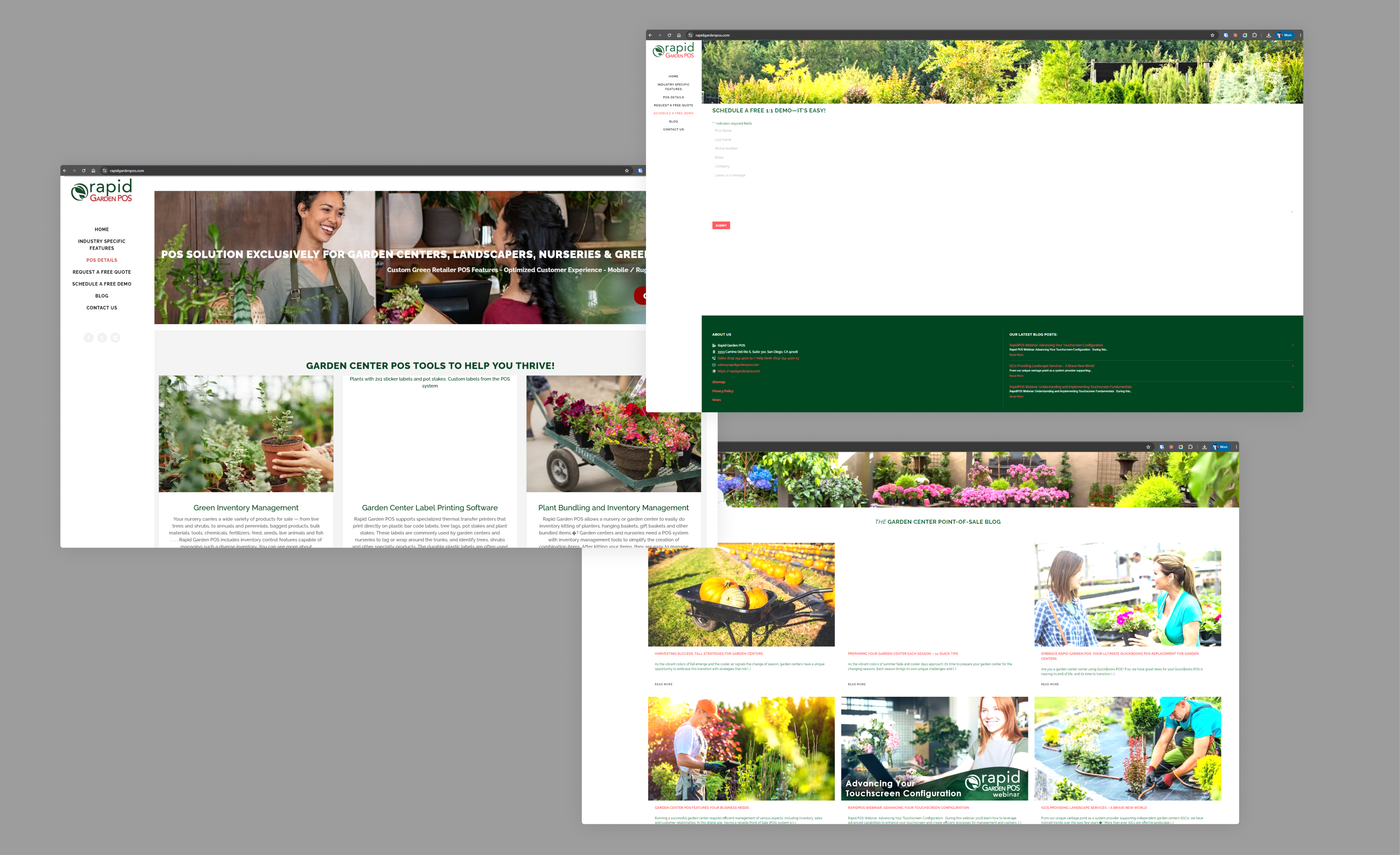
Generic pages were bouncing traffic, so we developed a new set of templates under the new identity. The team's input shaped the structure and content of every page, with each template designed around a specific vertical instead of the abstract "POS buyer."
Every template shipped with breakpoint-level depth. Desktop, tablet, mobile, all specified end to end, with no fallback layouts and no compressed afterthoughts. Engineering could build with zero guesswork.
The principle behind every page: write for the decision-maker, not the product. Meet them at their operational pain, then earn the next click.
Templates designed with the team, specified for every breakpoint.
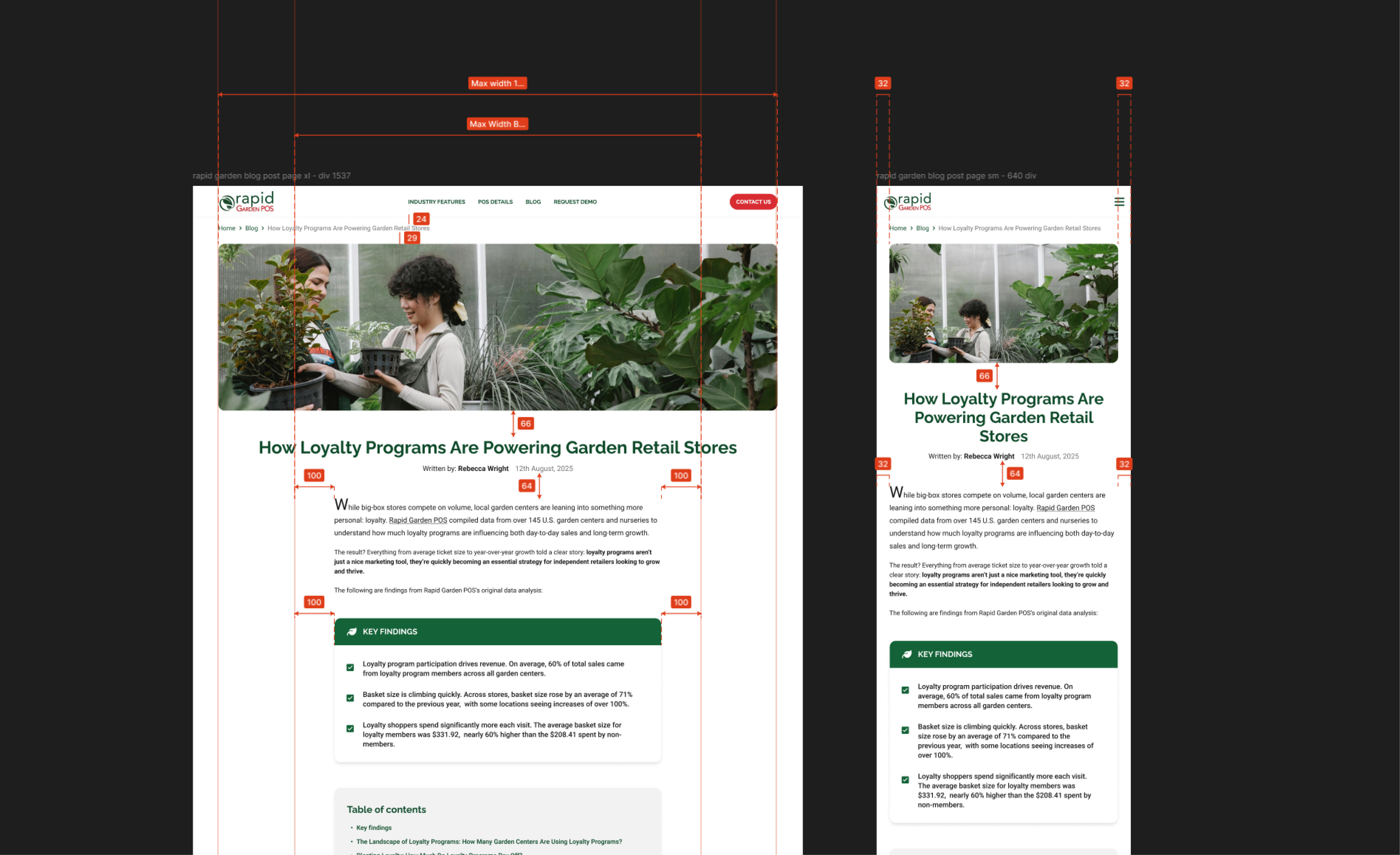
Blog, post template, and a PR strategy
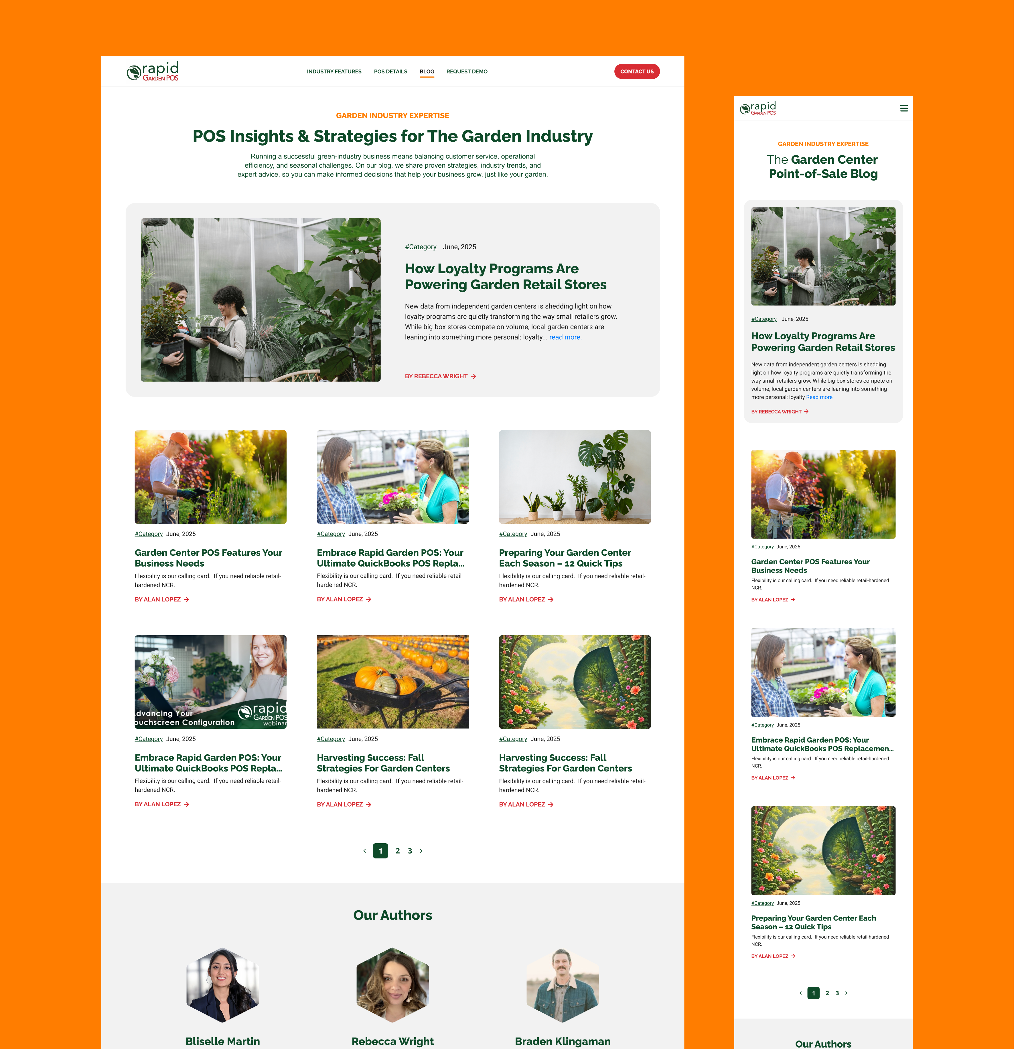
We audited every existing post, then redesigned the blog from the ground up. A cleaner blog interface, a new post template that gave editorial room to breathe, and an information architecture that made content findable instead of buried.
To anchor the new program, we published an original research study on garden center loyalty programs. The headline finding: 30% of garden centers running loyalty programs generate 56% of participating stores' revenue. One stat gave RapidGarden a credible, data-backed voice in industry conversations.
Paired with a refreshed PR strategy, the study landed in front of the industry press it was built for. The content didn't just sit on the blog. It compounded.
A new post template that gave editorial room to breathe, paired with a PR strategy that put the work in front of the industry.
The redesigned blog index. Structured content map, clearer hierarchy, and metadata that helped users find what they came for.
06 — Results
From digital footnote to growth engine.
By shifting from volume to precision, the numbers landed where they needed to. The relaunch produced RapidGarden's best month on record for MQLs, and the qualification data finally matched what sales actually needed.
+62%organic form fill conversion
+36%paid traffic form fill rate
+90%engagement rate YoY
+60%organic engaged sessions
-55%cost per lead from peak
+157%monthly MQL volume
“Sustainable growth isn't about driving more traffic. It's about designing a destination people actually trust.”
Key takeaways
Trust is the lens. Every fix (visual, brand, template, content) had to close a trust gap before it could move a metric.
Marketing data doubles as user research. The same signal that broke conversion broke the experience.
Design with the team, not for the team. Vertical templates land harder when the people who own those verticals shape them.
Depth at every breakpoint isn't optional. Mobile isn't a fallback. It's where most of the buyer journey actually happens.
Brand ecosystem alignment compounds. Trust earned by the parent transfers to the vertical, for free.
Rodrigo Martínez
UX Designer
RapidGarden didn't need more traffic. It needed a destination worth arriving at.
Fix the trust gaps, and the metrics follow. The work was less about driving people to the site and more about earning the visit once they got there.