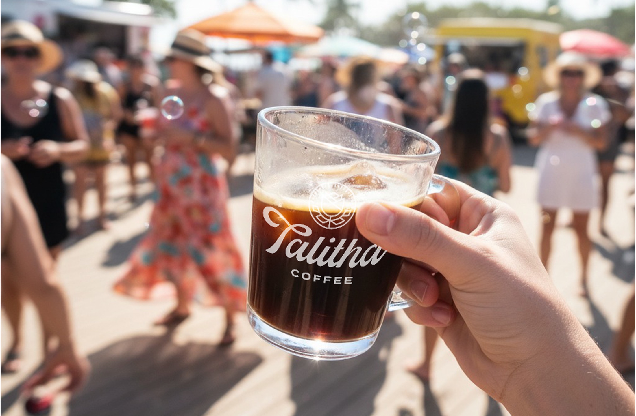
Talitha (formerly The WestBean Coffee Roasters) is a San Diego coffee brand with three cafés, a roastery, and a mission to end human trafficking. The name means 'little girl, arise.' When I came in, they were spending like a national ecommerce brand on a budget that couldn't carry it. My job: lead the UX and social media design strategy that pulled all that digital energy back home to San Diego, working from the SEO and marketing team data that shaped every decision.
+128%
Website traffic
1,567 → 3,569 sessions/month.
+64%
Branded search
More San Diegans searching Talitha by name.
~3.7%
Conversion rate
Held steady through the full redesign.
+33%
Café order value
Lift across all three café locations.
02 — Goals & Challenges
A brand mid-rebrand.
Talitha was moving from 'The WestBean' to a new identity without losing the regulars, while running on a local budget that didn't match the national ambitions of the previous strategy. The website reflected the confusion: it looked like a DTC ecommerce store and had completely forgotten that Talitha had three physical cafés in San Diego.
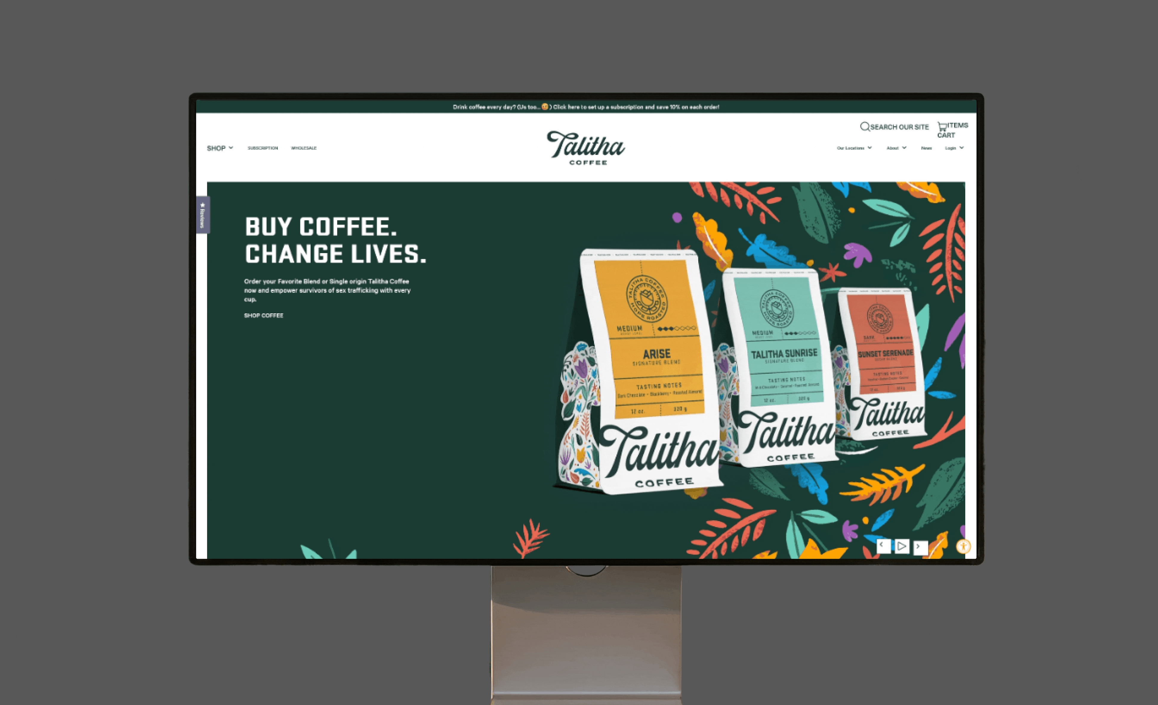
Fig. 01. The old site: all product grid, no hours, menus, or locations. Built to sell nationally, not locally.
Pain points
Budget spread too thin: national reach on local money, nothing compounded
Mid-rebrand confusion: moving from The WestBean to Talitha without a clear identity bridge
Website with no café presence: no hours, no menus, no location pages
Aggressive subscription intros pulled visitors in, then they bounced
Generic visual identity: polished but without personality or local connection
Three objectives
📍
Lead with UX
Rebuild the site around real local intent, informed by SEO, customer, and marketing data.
📱
Design for social
Treat Instagram and content as a primary design surface, not a brand-book afterthought.
🌱
Compound locally
Build San Diego gravity that grows over time, not national ad spend that evaporates.
03 — Research & Analysis
Three teams. One data picture.
I treated this like a design problem with three data sources to triangulate against. The customer database held the buying behavior. The SEO team held the local search intent. The marketing team held channel performance and what was actually compounding versus burning. None of them on their own showed the whole picture. Together they did.
Source 1: the customer database
Across 265,705 customers and 757,223 transactions in 8+ years of history, one number reframed everything: 72.4% of customers had visited only once. The whole business was running on a thin repeat base, not a wide loyal one. The lever wasn't more reach. It was depth.
265K+customers in database
757K+total transactions
72.4%single-visit customers
8+yrshistory analyzed
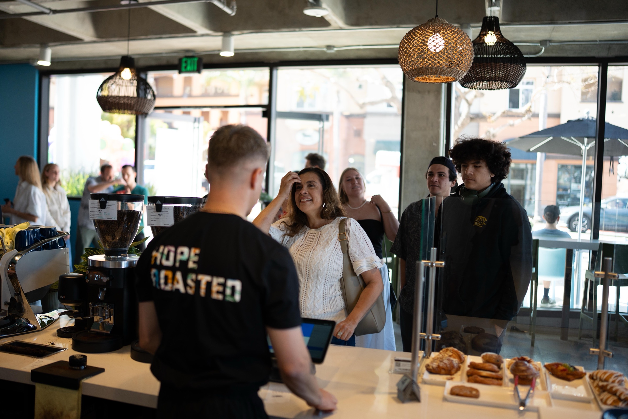
Fig. 02. Inside the Bankers Hill café. The locals knew Talitha. The website didn't know them back.
Source 2: SEO search intent
The SEO team's keyword data filled in the second layer. Branded search for 'Talitha coffee' was climbing in San Diego, and 'coffee near me' queries inside the city were pulling traffic that the site couldn't catch. There were no neighborhood pages, no hours, no menus to surface in local results. People were searching with local intent and landing on a national checkout flow.
Source 3: marketing channel data
Marketing closed the loop. The national ad spend was pulling traffic that didn't convert and didn't return. Local social engagement, by contrast, was sticky: people who followed the cafés on Instagram came back. The math was obvious in hindsight. Stop chasing the country. Go deep on San Diego.
04 — Strategy
Go deep, not wide.
The bet, agreed across UX, SEO, and marketing: stop chasing the country, go deep on San Diego. A dollar spent building local gravity compounds. The same dollar scattered nationally just evaporates. The strategy flipped the site's hierarchy in one move: cafés first, ecommerce second, and social as a primary surface instead of an afterthought.
A note on attribution: there's a +571% DTC ecommerce lift floating around from this period. That's a real number, but it was driven by a separate national influencer program, not by the redesign. Where I can point to actual design impact: the café-first rebuild (+128% traffic, +64% branded search) and the in-store order value lift (+33% across all three locations).
The new homepage
The homepage became the load-bearing decision. The first scroll had to deliver the cafés, the mission, and the neighborhood story before anything tried to sell a bag of coffee. Below the fold, the shop is still there for the national audience. Above it, San Diego comes first.
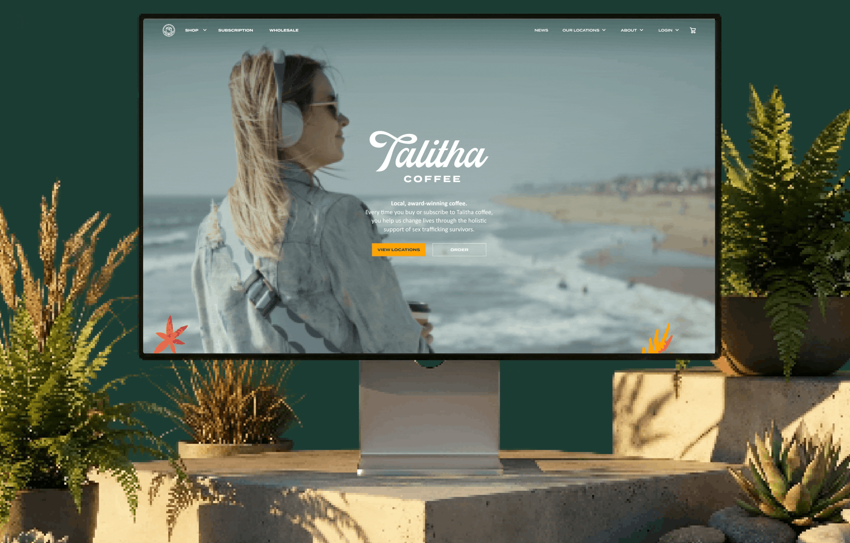
Fig. 03. The new homepage: cafés and mission lead. Shop sits below, not on top.
The hero video
Working with Paul, our in-house editor, I shaped a short video clip designed to capture Talitha's brand personality. It anchors the homepage hero, setting the tone before anyone scrolls past it.
Fig. 04. Hero video, made with Paul (in-house editor) to lead the homepage with the brand's actual personality.
05 — UX/UI Design
Built for the neighborhood.
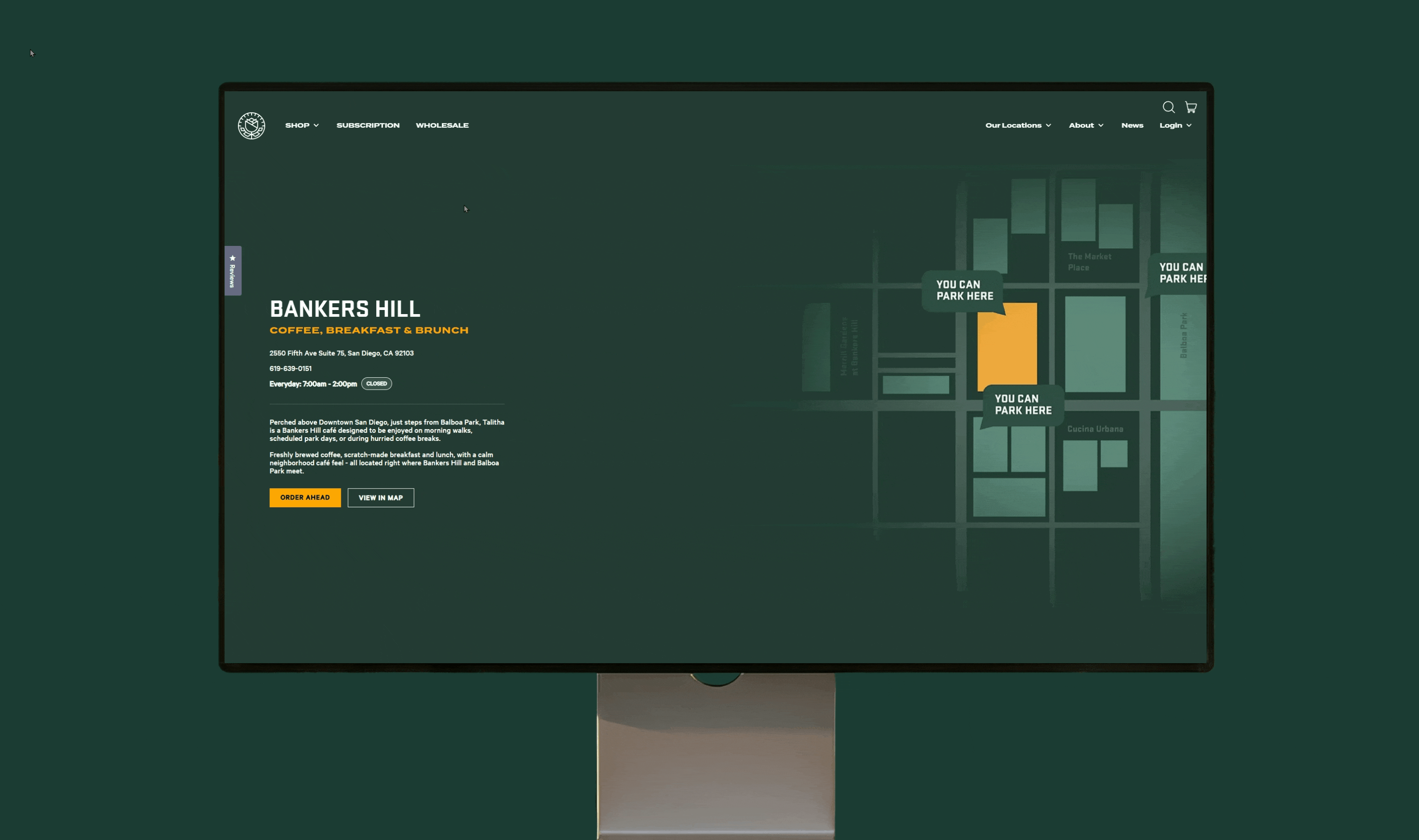
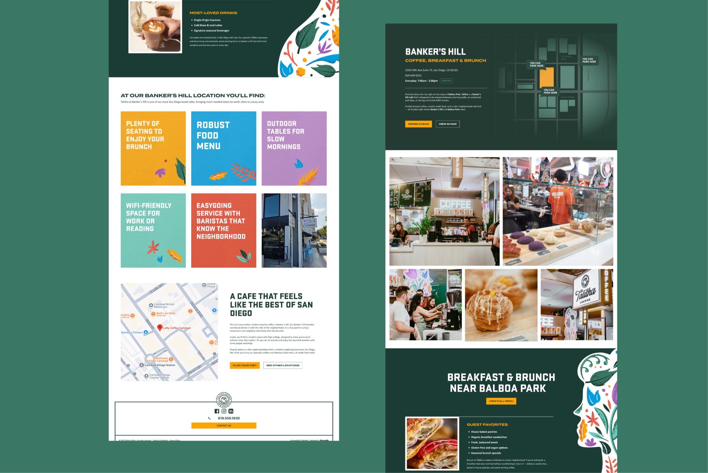
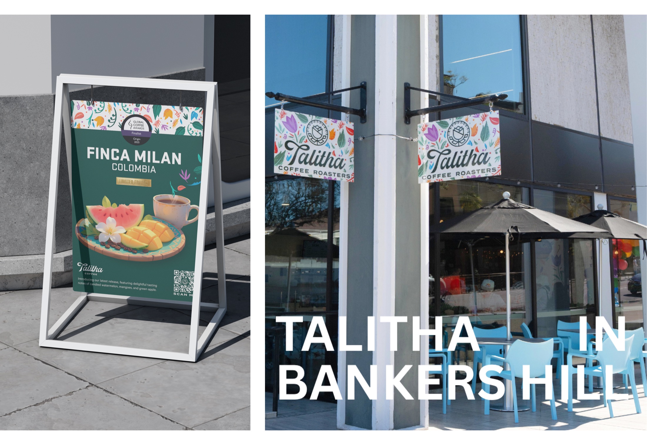
With the homepage leading visitors into the neighborhood, the next layer had to deliver on that promise. The old site had no real café presence: a single locations page with addresses and not much else. I rebuilt each neighborhood as its own destination, one for Bankers Hill, one for Clairemont, one for Liberty Station, with real menus, real hours, real maps, and community photography. People looking for coffee near them found a place, not a directory.
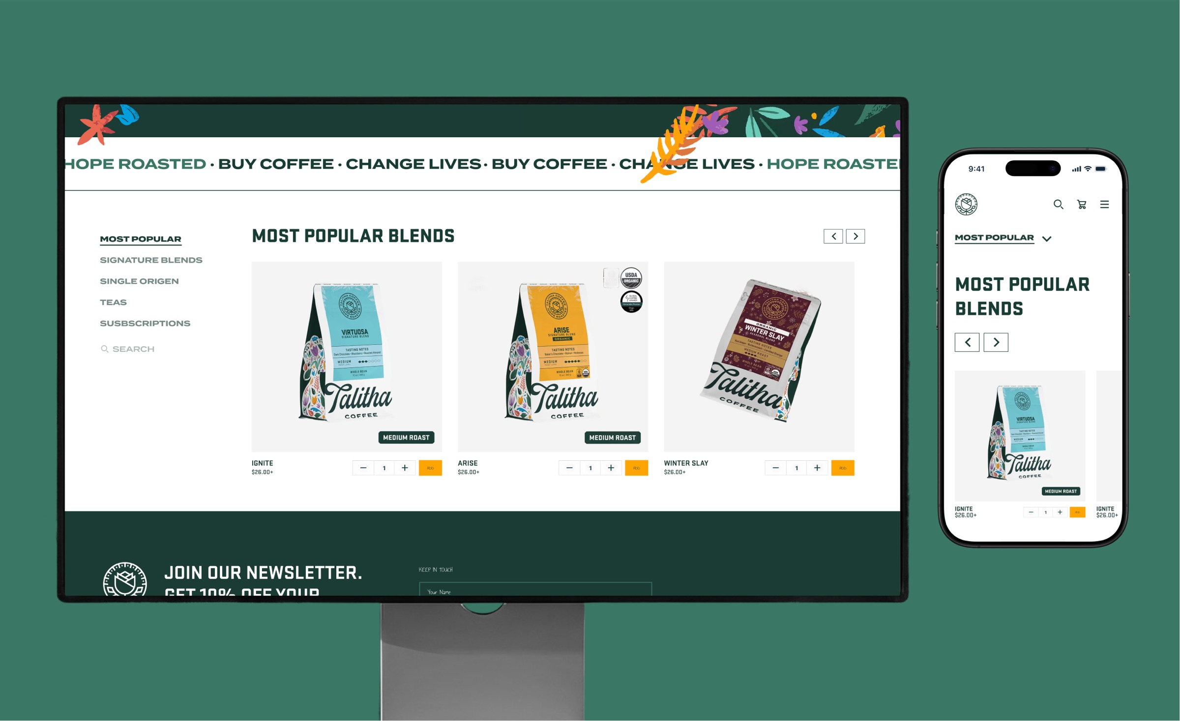
Shop improvements
The shop still had to sell coffee nationally, so I cleaned that up without losing ground on conversion. Sticky sidebar navigation so you never lose your place between collections. Quick-add on the product cards so you can build a cart without leaving the page. Clear roast tags and certification icons to speed up decisions. And a calm, dismissible mission banner to replace the old all-caps marquee.
Sticky sidebar nav so you never lose your place between collections
Quick-add on product cards to build a cart without leaving the page
Roast tags and cert icons for faster decisions at the product level
Soft newsletter signup below shop, no popup, just context
~3.7%conversion (steady)
+33%café order value
67%one-timers (down from 72.4%)
Email marketing support
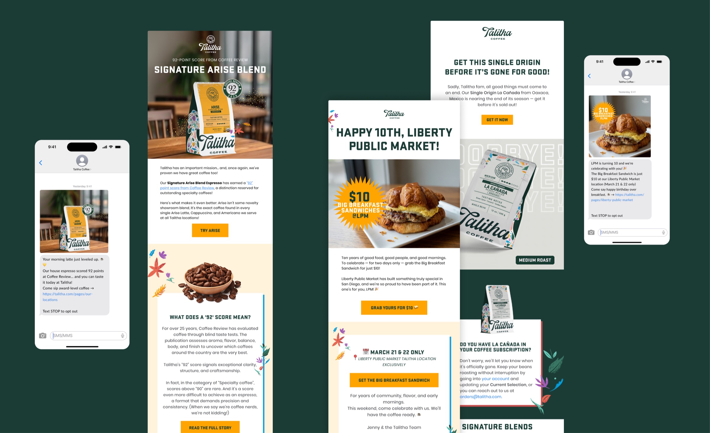
Beyond the main redesign, I also jump in to support the email marketing team on some of their campaign designs. Mostly seasonal launches and product drops, keeping the site, social, and inbox landing on the same beat.
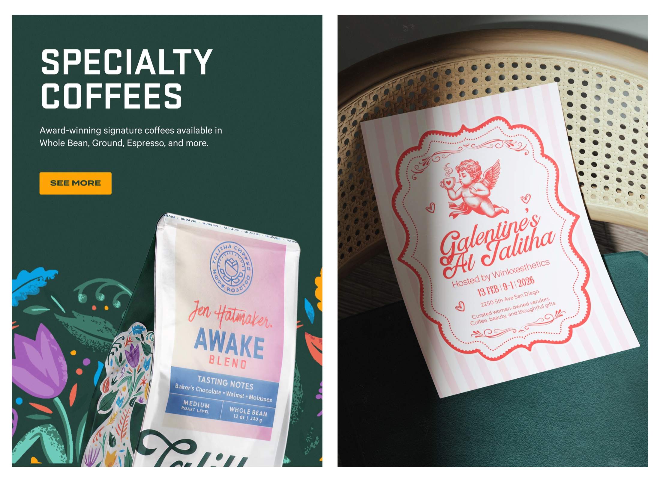
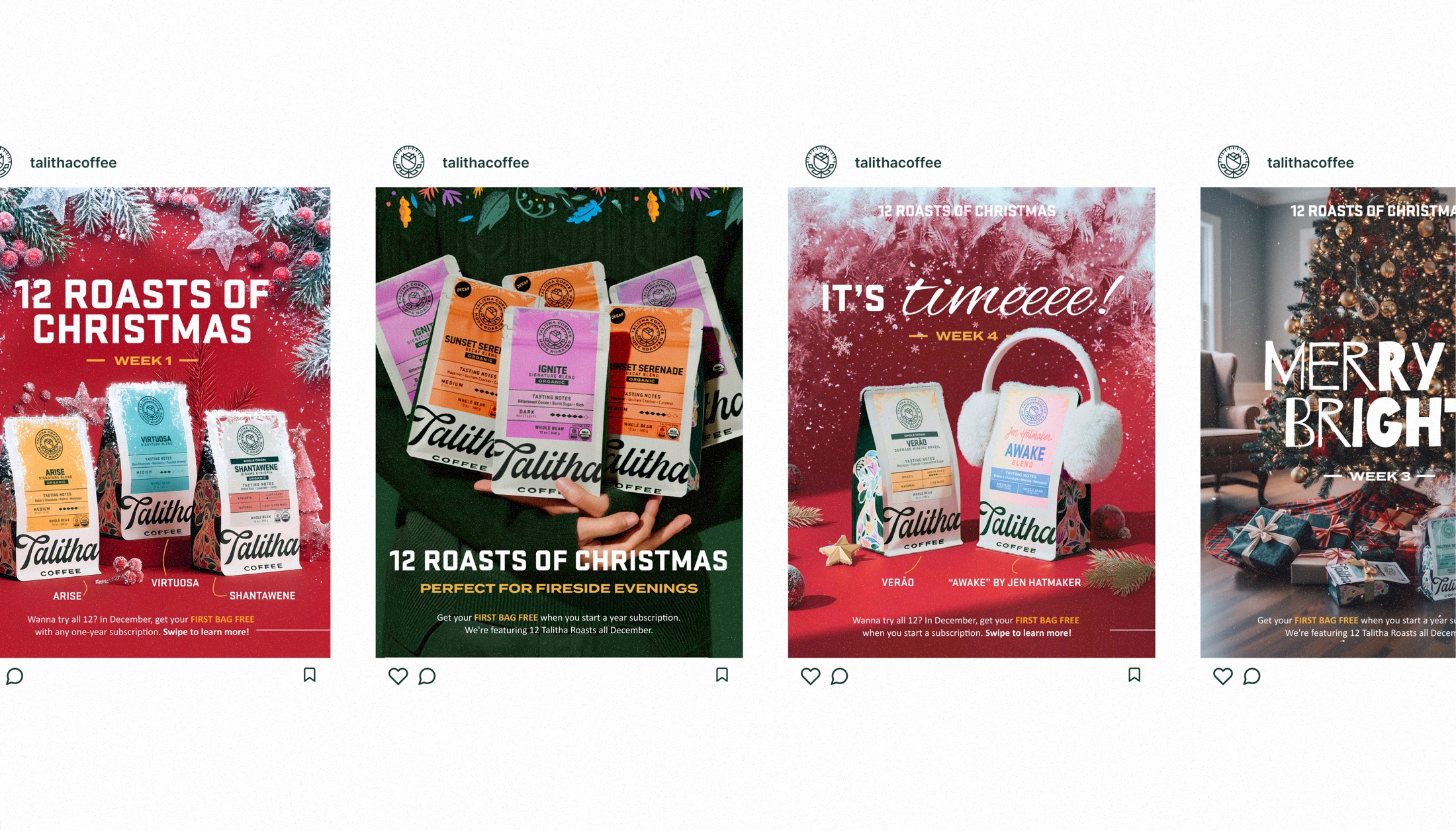
06 — Social Media Design
Designed for the feed, not just the framework.
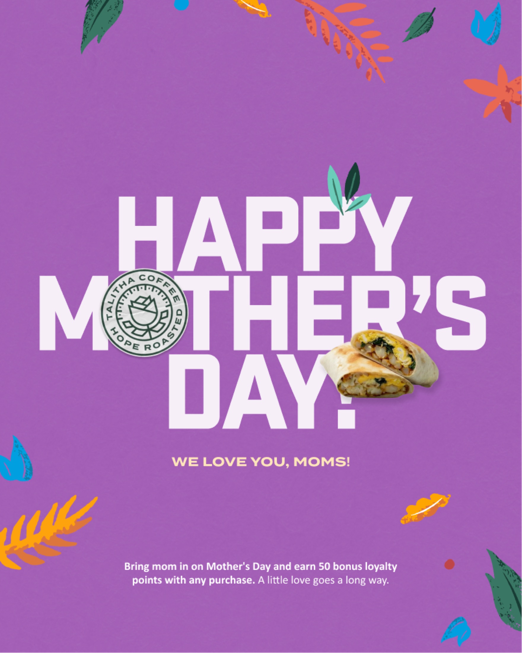
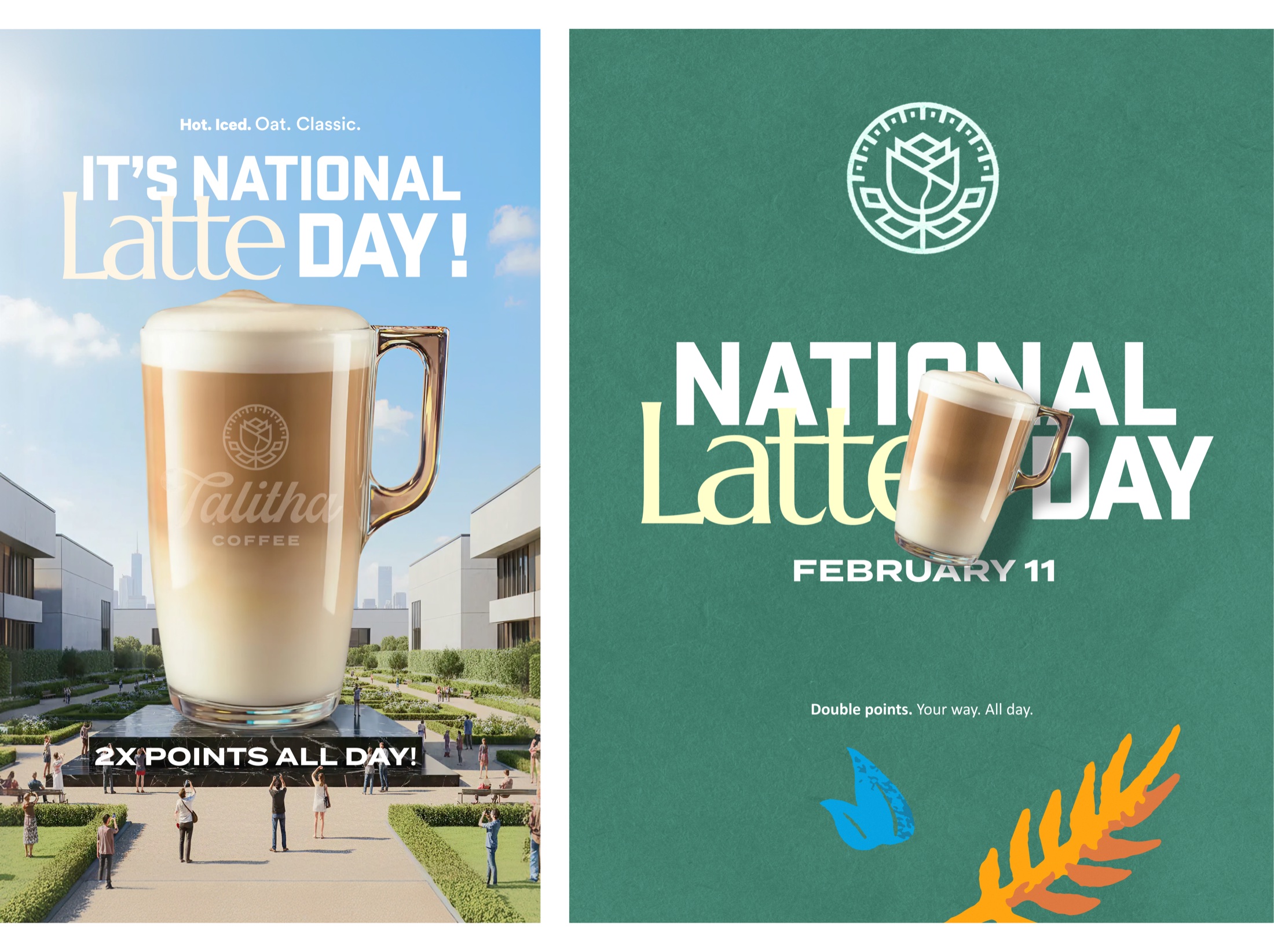
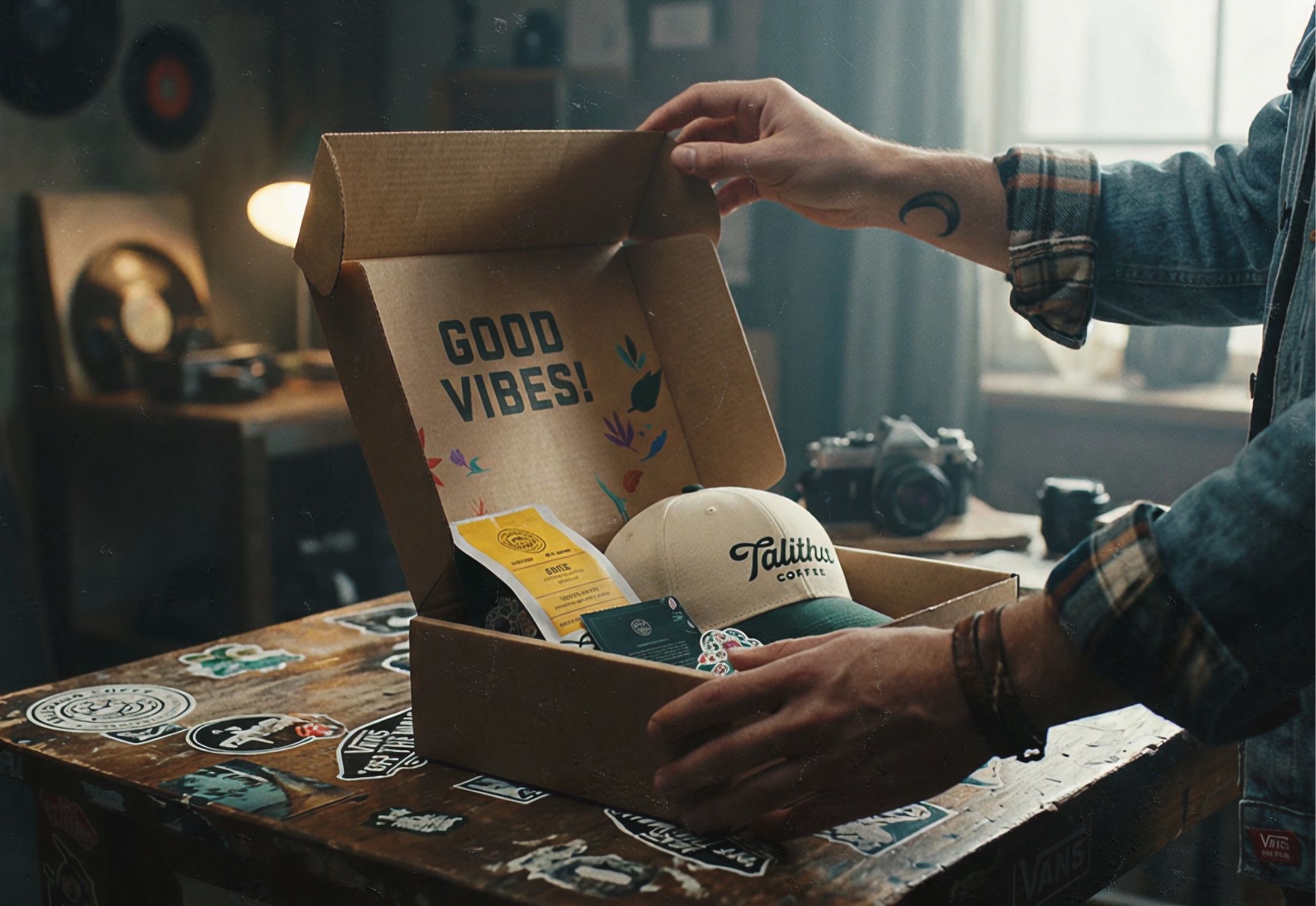
Social got the same energy as the site. The feed, the packaging, the seasonal stuff (Christmas drops, holiday limited releases, the fun launches) all designed as one system instead of one-off posts. A handful of those pieces ended up doing double duty in digital PR too, picked up by press and partner placements. To keep up with the volume, we leaned on AI for first drafts, mockups, and quick variants, then I'd push the ones that mattered into final design. It cut hours off every campaign and let us ship more without the work feeling cranked out.
+343%reach YoY
+235%Instagram followers
2,260 → 7,569follower growth
Want to see more?
Visit Talitha directly to see the work in the wild, or check out the full publication on Behance for more design context.
Building the local digital presence Talitha deserved was one of the most rewarding projects I've worked on. When a brand starts resonating with its community, you feel it in the numbers, and in the neighborhood.
The redesign moved the metrics, but what stuck with me was that Talitha finally felt like the San Diego brand it always was.